About this text
The following text is a summary of my Bachelor’s thesis that I submitted over a decade ago in 2012. Since the topic is still relevant, I decided to write this overview in October 2024. That’s why you will find images from 2012 along with screenshots that were taken with recent software.
Introduction
In the Federal Republic of Germany, more historic building fabric was destroyed in the years following 1945 than during the Second World War itself.1
Yet, the significance of historical buildings as a cultural treasure of the nation had already been recognized during the German Empire. The first nationwide law on monument preservation was initiated during the Weimar Republic and came into effect in 1934. Since that time, the law has undergone only minor changes.
Monument preservation has traditionally been a matter for the federal states, and in individual cities, it is overseen by city master builders. Monument preservation is defined as the “conservation of building substance for future generations”. It is explicitly emphasized that this building substance includes not only the physical structure itself, but also, where applicable, its interior and visual appearance within its surrounding context.2
Currently, monument preservation is taken very seriously in German urban planning. The responsible offices have an independent veto right in all construction projects, which can prevent demolitions or construction measures.
Given this starting point, the following issue seems perplexing: although historical façades are considered worthy of protection under the legal framework of monument preservation, any inscriptions or signage on these façades are often destroyed during restoration. In this process, it generally does not matter what technique (painting, engraving, stucco work, etc.) was used to apply the lettering.
Furthermore, it is evident that only rarely are high-quality and digitally usable (as will be discussed later) photographs of the typography on the original façades taken. As of now, there is no standardized procedure in place for how these photographs should be captured.
In my bachelor’s thesis, which I completed around 2012, I sought to address this issue from a practical perspective. Under the topic “Reconstruction and Digitization of Industrial Signage”, I aimed to answer the following research question:
How can historical inscriptions on buildings be conserved in the spirit of active monument preservation and transferred into digital media environments for active knowledge preservation?
Active monument preservation refers to the concept that preservation efforts should be proactive, meaning they take action before any planned alterations to the building fabric occur. It is irrelevant whether the entire structure is deemed worthy of protection or only a part of it (such as the mentioned inscriptions) holds cultural value.
Active knowledge preservation is understood as an approach that treats historical knowledge not merely as archival material but ideally as a learning process in which cultural heritage serves as a pool of ideas and solutions for modern media challenges.
Which kind of typography is particularly endangered?
The greatest threat of destruction concerns historical inscriptions that were created between 1920 and 1950. For older inscriptions, the cultural value of preserving the architecture unchanged is now largely recognized by society. (For example, historical epitaphs on sacred architecture would certainly be replicated/conserved if renovations were necessary.) More recent inscriptions, dating from around 1955 onward, are often derivatives of well-known typefaces, which may have been adapted to fit the façade. If replicas were needed in such cases, there is generally enough source material available to reconstruct the façade’s appearance.
This distinction highlights the particular vulnerability of signage from the late 19th and early 20th centuries, which often lacks the same level of recognized cultural significance or comprehensive documentation, making their preservation and digital conservation all the more urgent.
Object of investigation
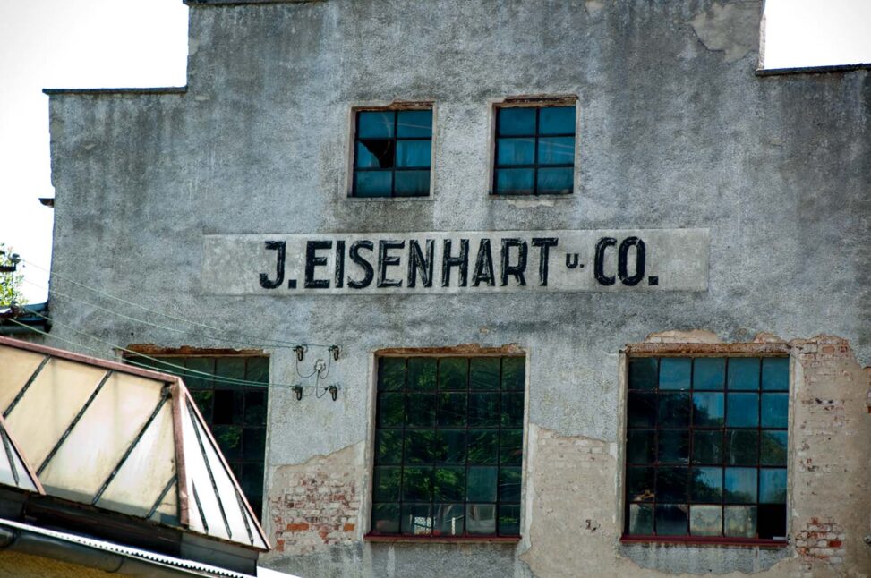
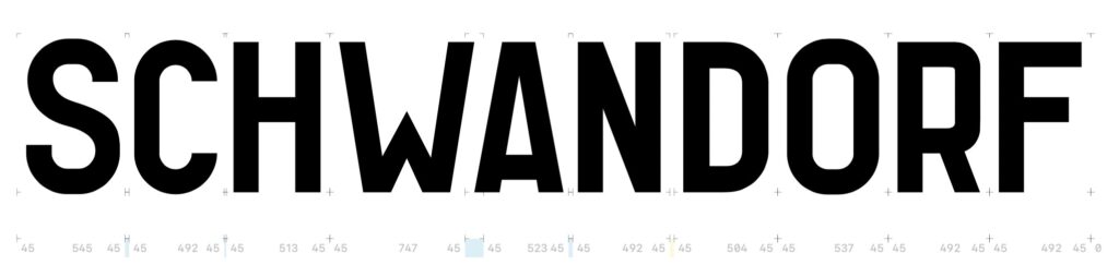
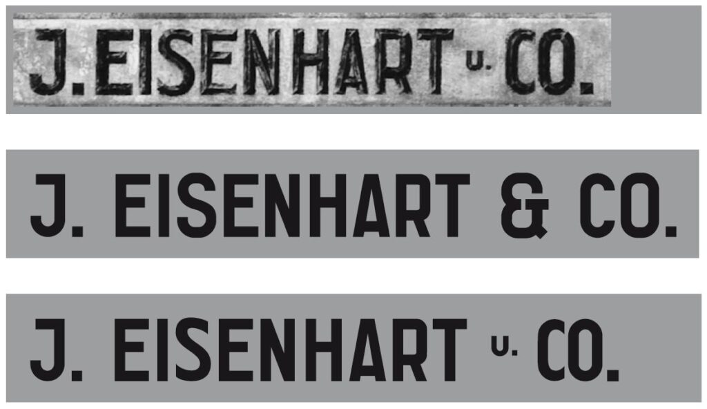
For my thesis, I selected a research object located in a rather hidden corner: the façade of the so-called Eisenhart Building in Schwandorf, Bavaria. Although this building was not in immediate danger of demolition at the time, there was still concern that the signage on the façade might be painted over during potential renovation work. This concern arose from the fact that the company Eisenhart had not existed for decades, and the building was being used for other purposes.
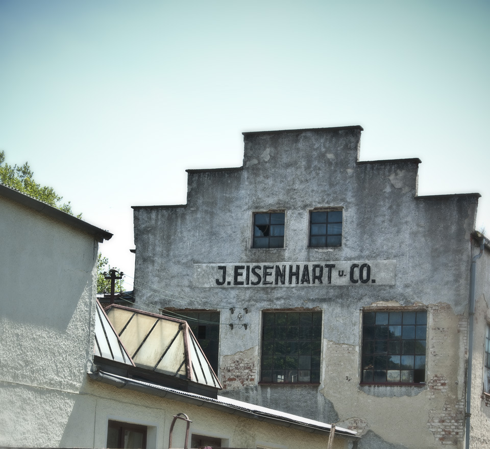
The choice of this building highlights the precarious status of such historical inscriptions, especially when their original context has been lost or forgotten. Despite the absence of immediate threats, the risk that these cultural artifacts could be erased during future changes underscores the importance of proactive monument preservation. In this case, preserving the Eisenhart signage meant not only conserving a part of the building’s physical history but also maintaining a connection to the region’s industrial past, which could otherwise be easily overlooked.
Capture process
In order to properly digitize the lettering, a photographic template was necessary. However, the conditions on site did not allow for the signage to be photographed without distortion. Since other buildings partially obscured the façade, the photograph had to be taken from an angled perspective, introducing slight distortions in two dimensions. Specifically, this resulted in marginal angular errors both in azimuth and elevation. To minimize the error in elevation, I chose a vantage point relatively far from the building.
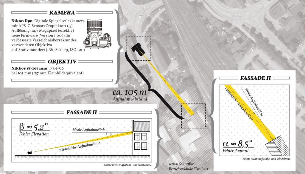
As a student with limited financial resources at the time, I also faced the challenge of not having access to high-quality telephoto lenses. I had to work with an APS-C camera (Nikon D90), which provided a resolution of “only” 12 megapixels. Despite these limitations, and using the 18–105mm kit lens, I was still able to produce a usable photograph, although it cannot compete with today’s photographic technology. Nevertheless, the resulting image was sufficient for the purposes of my project, even though higher-quality equipment might have allowed for greater precision and detail in capturing the original lettering.
Digitization Process
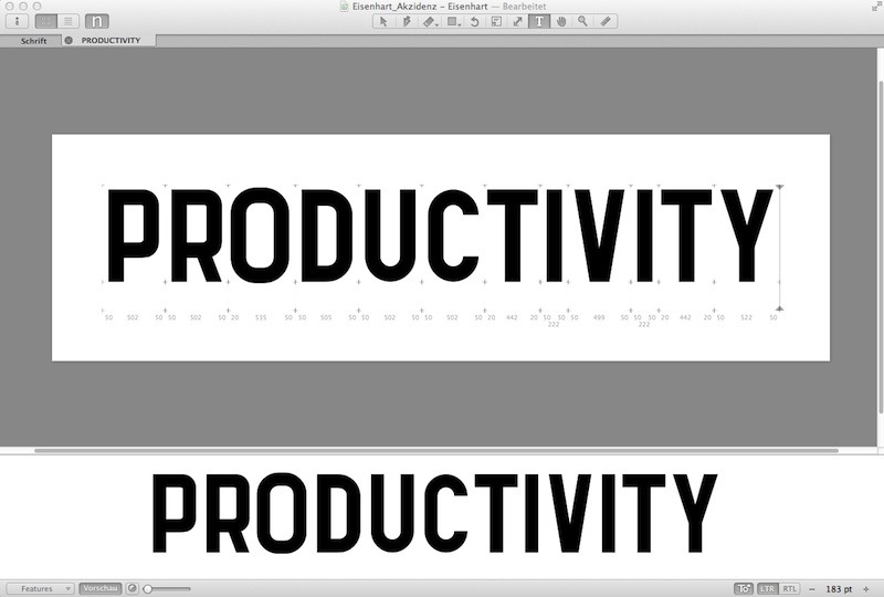
The goal of the digitization process is not merely to create a digital facsimile, but to develop a fully functional font. Since the lettering on the façade represents only a small subset of the alphabet, it is necessary to understand the design language of the inscription in order to extract the “essence” or “DNA” of the typeface. Only once this design language is identified the missing letters of the font can be reconstructed.
For this reason, simply vectorizing the template by tracing the outlines with Bézier curves would be insufficient. Instead, research was needed to understand the common techniques used for creating signage on façades during that period. While the exact date when the inscription was added to the building cannot be determined with complete certainty, there are photographs from 1952 that already show the building with the signage.3 Additionally, my research in the Schwandorf city archives revealed that the building itself was constructed around 19494 and was already owned by a company named Eisenhart at that time. It is therefore safe to assume that the inscription was created within this time frame.
I am particularly grateful that, during my research, I came across Ernst Bentele’s work “Schrift: geschrieben, gezeichnet und angewandt” from 1952, which describes the common practices of façade painters at the time, including how inscriptions were first designed and then transferred onto building façades.
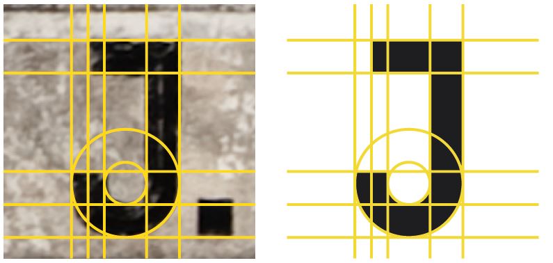
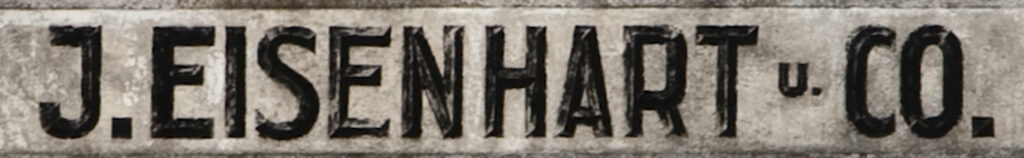
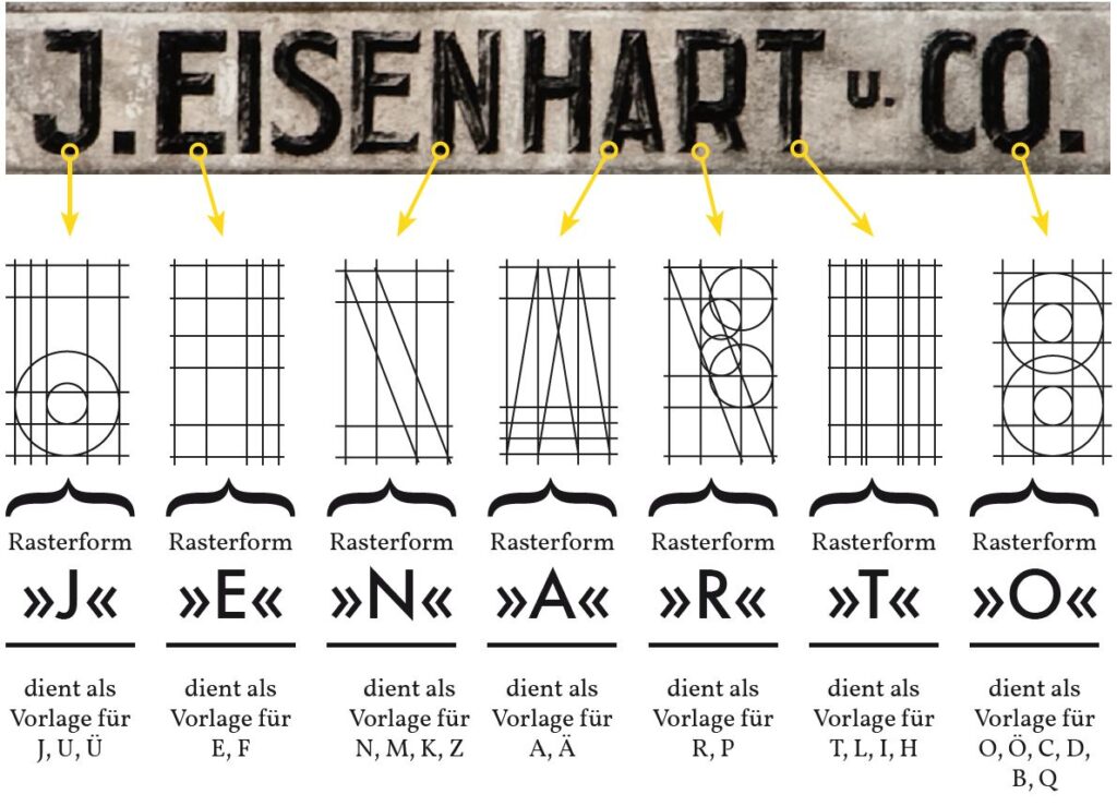
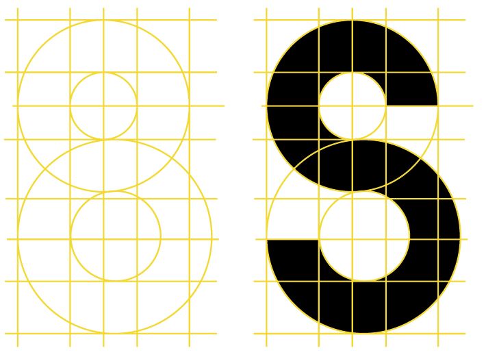
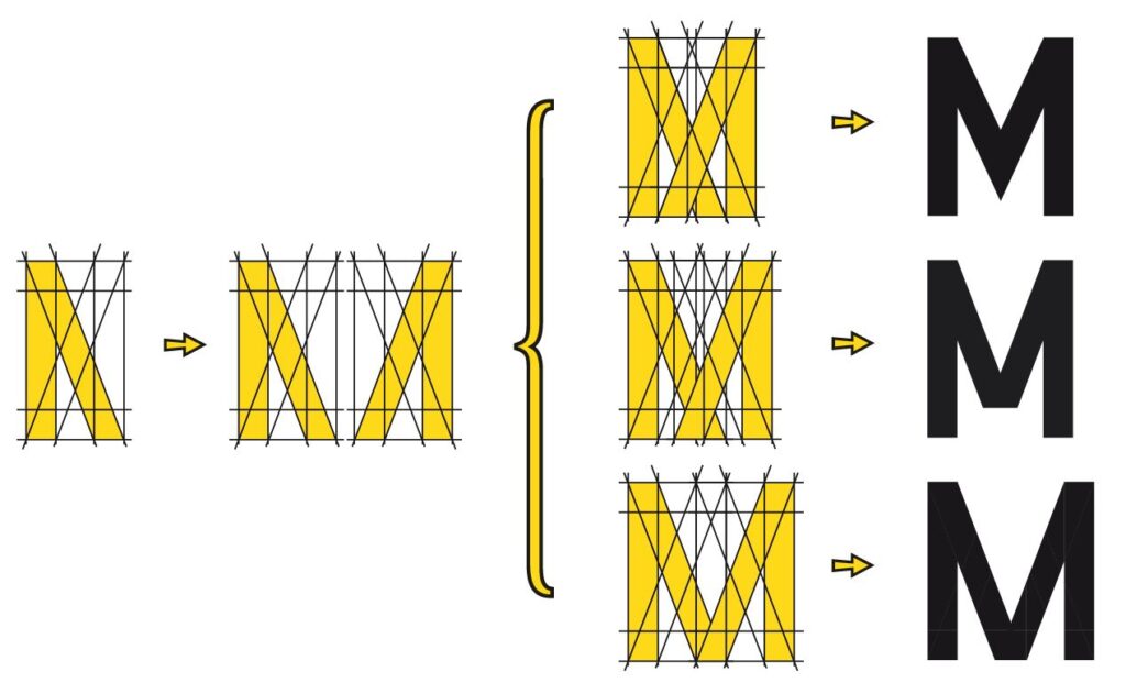
It became clear that the Eisenhart building’s signage was constructed using a grid system. This insight was crucial for understanding the lettering’s proportions and structure, which could then be applied in the digital reconstruction process. The grid-based approach, typical of that era, provided the framework for consistent letterforms, and using this knowledge allowed me to extrapolate the missing characters based on the existing ones.
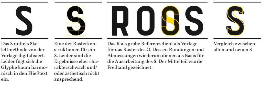
However, it became evident that two letters, specifically the S and C, could not be constructed using the grid system; they were likely drawn freehand. I will therefore revisit the design history of the uppercase S in greater detail. As my first approach to digitization, I chose the “classic” vectorization method by tracing the contours of the photographic template with Bézier curves. This method, however, did not yield satisfactory results, as the resulting shape appeared ‘too organic’, with the stroke thickness being too inconsistent.
For the second approach, I employed a technique I referred to in my thesis as the ‘skeleton method’. In this method, only the central axis, or the ‘skeleton’, of the photographed letterform is extracted. This central line is then extrapolated by adding thickness to achieve the desired stroke weight. After some fine adjustments, this approach allowed me to achieve a very close approximation to the original form.
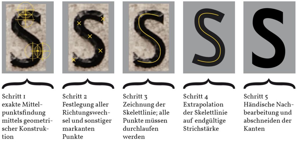
Unfortunately, a problem arose: while the S constructed using the skeleton method closely mirrored the original template, it did not integrate harmoniously into running text. At this point, it is important to reiterate that the goal of my work was to create a functional digital font, meaning that it needed to be optimized not only for fidelity to the original but also for practical usability.
For this reason, I also experimented with a purely constructive solution for the glyph, based on the grid system. However, this approach also failed to produce promising results. The S created with the grid system lacked the fluidity and character of the original, resulting in a letterform that felt rigid and out of place in the overall typeface.
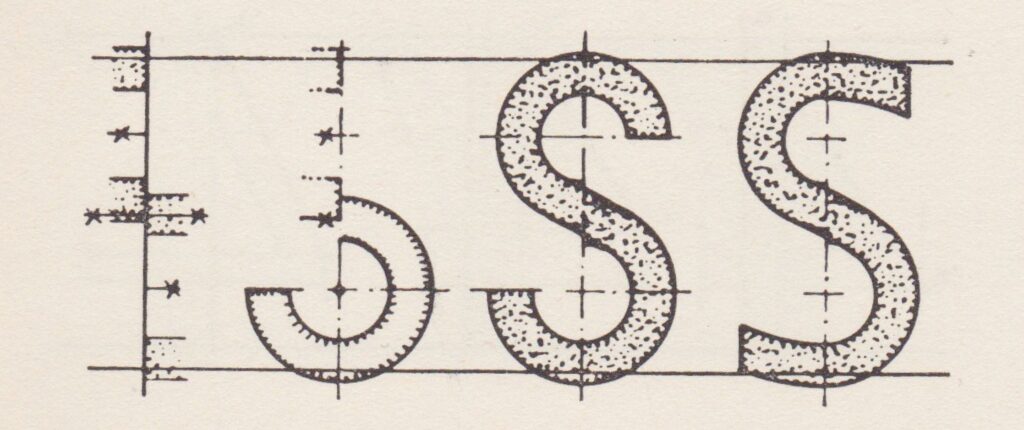
For this reason, I recalled Ernst Bentele’s work, where he suggested designing the S as a hybrid, incorporating both constructive and freehand-drawn elements. This hybrid approach struck a balance between structure and fluidity, allowing the letterform to adhere to the grid system’s geometric consistency while retaining the organic, hand-drawn quality necessary for a visually pleasing result.
With these considerations in mind, I transitioned to Adobe Illustrator, where I used the grid system along with some freehand lines to create the shapes for each individual letter. For the grid method, I made extensive use of the “Live Paint” function, paying close attention to cleaning up the resulting shapes by removing any unnecessary anchor points. My goal was to maintain clean, smooth curves that still conveyed a sense of being carefully constructed.
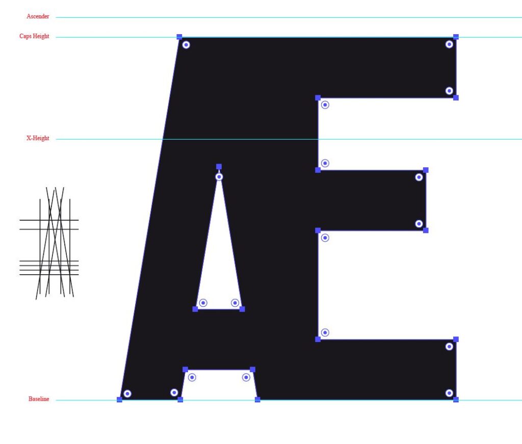
Already here it becomes apparent that sticking to a purely constructed (i.e. derived from the original grid) shape will not fulfill the requirements to a modern (body) font. E.g. the head of the uppercase A is simply too bold and creates an optical disbalance. That’s why I alse developed an ‘extended’ grid that uses the combination of two templates at once to create the shapes for wider letters, such as the uppercase W and the uppercase M.
The final stage of font development was initially carried out in FontLab. However, due to the program’s instability on my Mac, I switched to the then relatively new app Glyphs6 to complete the process. In Glyphs, I combined the vector shapes into a coherent typeface, taking advantage of the app’s more intuitive interface and stability.
After a lot of tweaking I decided to preserve most of the quirks of the initial template to stick as close to the original’s spirit without trying to create a ‘perfect’ copy. I also decided that I did not want to ‘polish’ the letterforms too much, since the font should follow to non-perfect design language of the historical lettering.
Note: ‘Eisenhart’s Legacy’
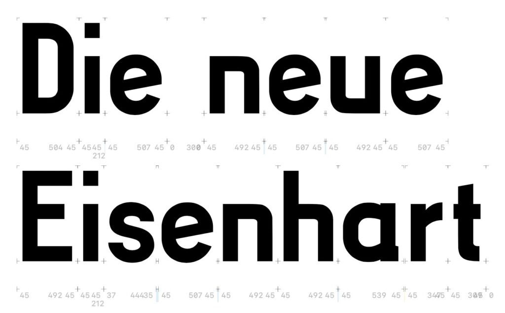
I also did some experiments how to further develop the initial letter shapes. Therefore I created a new found that has deep roots to this project. The new font is called ‘Eisenharts Erbe’ (“Eisenhart’s Legacy”) and can be downloaded and used freely here.
Conclusion
The resulting font is quirky, since it was never intended to be used as body font. The font contains a number of optical ‘weaknesses’ that, unfortunately, cannot be easily corrected without compromising the overall aesthetic. Given the limited time available for a bachelor’s thesis, however, I am satisfied with the result. Even though the architecture itself may eventually disappear, perhaps the spirit of Eisenhart will live on, in some small way, through this typeface.
Footnotes
- Petzet, Michael (Hrsg.) (1975): Eine Zukunft für unsere Vergangenheit – Denkmalschutz und Denkmalpflege in der Bundesrepublik Deutschland. München: Prestel-Verlag. ↩︎
- Schiedermair, Werner & Scherg, Jutta (1991): Denkmalfibel – Praktische Hinweise zu Denkmalschutz und Denkmalpflege in Bayern. München: Callwey ↩︎
- See e.g. the self-published work by Josef Fischer and Alfred Wolfsteiner (2011): Schwandorf aus der Luft 1956. ↩︎
- The building plan was submitted to and approved by the city’s building office (‘Stadtbauamt Schwandorf’) in October 1st 1949. ↩︎
- Bentele, Ernst (1952): Schrift: geschrieben, gezeichnet und angewandt. Ulm: Karl Gröner Verlag. ↩︎
- https://glyphsapp.com/ ↩︎
Comments are closed.