For the series Medien- und Gestaltungsästhetik (transcript publishers, editor: Prof. Dr. Oliver Ruf) I regularly design the vector illustrations that are used on the cover (see here). With this post I would like to make my underlying thoughts and design concepts transparent. For this purpose, I’ll show you the approach to this project, the tools I used, and also the many considerations and ideas that ultimately turned out to be a dead end, using the cover of Tom Poljanšek’s Realität und Wirklichkeit as an example.
Status Quo: The design language of the series
The original graphic for the first volume was created as a student project. This graphic is representative of the design language of the series, so to speak. If one would like to summarize the aspects, then one could distillate the look and feel to these basic principles:
- minimalist ductus
- vector graphics
- hardly any variations in line width
- “technical” aesthetics (à la: CAD construction drawing)
- monochrome: graphics consist exclusively of white lines set on a solid color. Hatching etc. does not take place.
The author’s briefing
Tom wants a graphic that communicates the dualism of an everyday object. The object should be characterized by its simple profanity, but at the same time address the “shared” interpretation of reality by a combination of wireframe and minimalist outline.
The Everyday Object
To quote the covers of the first volume, a mundane object is needed that:
- can be implemented in a minimalistic way
- does not have too many details that absolutely have to be depicted
- has “iconic” qualities = can be read as an icon representative for the “ontological everyday object”
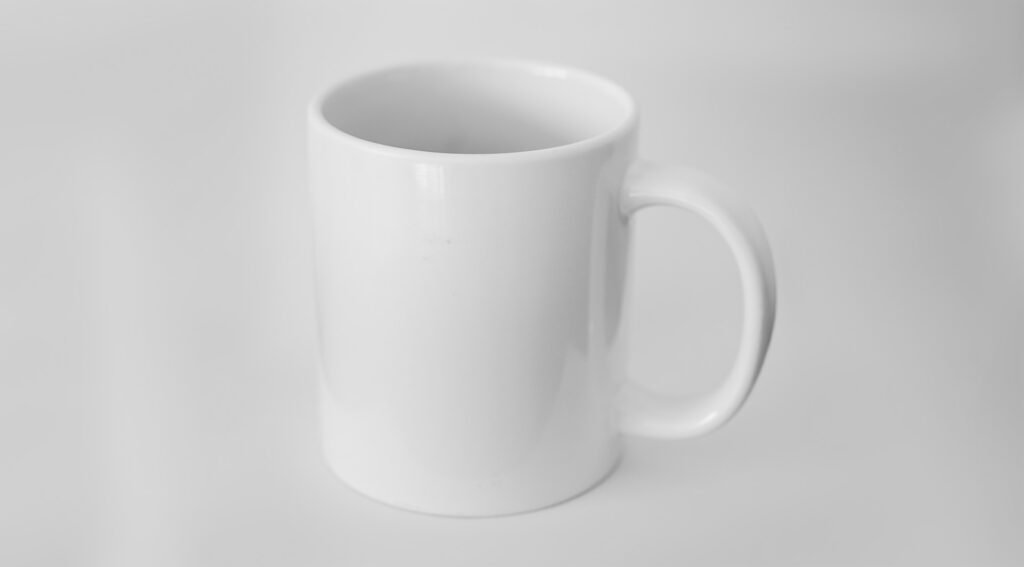
The choice fell quite quickly on a cup/mug.
In search of THE cup: what does an “iconic” cup look like? In consultation with Tom, we settled on a “mug” for the first design iteration:
Workflow
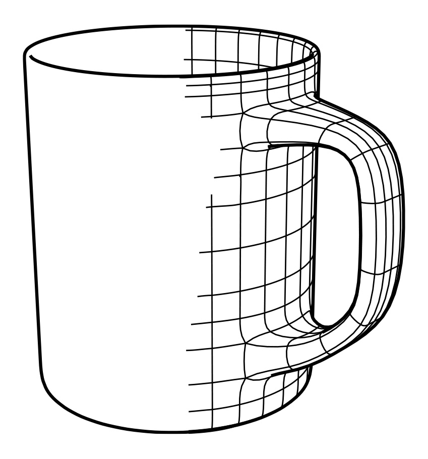
I’m also using this project as an experimental playground to rethink and revise my old workflow a bit. Since the design takes reminiscences to 3D wireframes anyway, it makes sense to actually recreate the mug as a “real” fullscale 3D object. In the past I would have used Cinema4D for this task, but lately I’m learning to appreciate Blender more and more. The modeling is quite straigtforward (although the workflow between each software differs fundamentally: In Cinema4D I would have used the “lathe” object and a spline, while in Blender I now proceed with standard hard-surface modeling and a subdivision-surface modifier).

Perspective and view
Since “real” perspective shifts are possible in 3D space, the question arises, with which camera view the mag should be rendered. The possibilities of 3D are therefore both a curse and a blessing.

Beyond that: The possibilities to represent a wireframe are equally endless: Should the cup itself be transparent? Should the polygon mesh be made of triangles, quads or n-gons?

When making these decisions, it helps to remember the original design principle of the series: despite the visual opulence of the wireframe, a minimalist feel should be created. Therefore: The “cleanest” version fits best: We ride with the reduced quad version without transparency.
Export
For the cover a printable vector file is needed. This means that a rendering is not useful at this point, rather the current camera view must be exported as vector lines. In Cinema4D this works via a Sketch-and-Toon shader and exporting the output as Adobe Illustrator (*.ai) file. In Blender I use the SVG export plugin that outputs Eevee’s “freestyle”-lines as SVG. The possibilities that Blender offers here are immense. I can specify which polygon lines are to be exported later as a vector and which are to be hidden (“Edge Mark” in the Layer Properties menu becomes my new best friend). Neat! What I also appreciate is the possibility for display optimizations of the Subdivision Surface modifier (checkbox: “Optimal Display”). Especially the reduced, curvy look fits well with the minimalism of the design principle of the series. For postprocessing, minor adjustments and cleanup I import the SVG files in Adobe Illustrator.
Combining the views
Since Tom wishes a combination of object and wireframe, I rendered two different versions of the cup. Once as a minimalist outline and once as a complete wireframe. Using the vector eraser and the lock layers function in Illustrator, I take away some wireframe lines to bring out the outline
Experiments with the everyday object
Since it should be clear that the “non-virtual” side of the cup is used as an everyday object, I experimented with emphasizing it again by adding a tea bag.

Effect in context
For proper evaluation, it is a good idea to let the illustration already work within the cover. At this point, the color scheme of the background was also up for debate.

Drafts for the inner part
For the intermediate pages of the interior section of the series, I devised an abstract design language that combines the aesthetics of a 3D rendering with the aesthetics of classic print productions. The goal is to revisit the artifacts of the cover and to alienate them in terms of perspective. As an example of such pages, I have reproduced Volume 8 (Design Aesthetics) here.

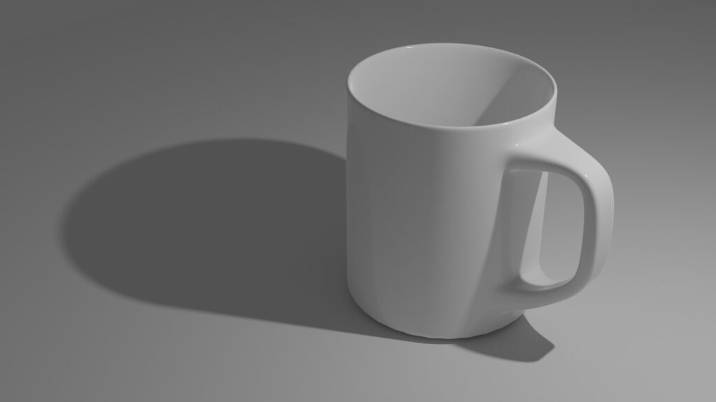
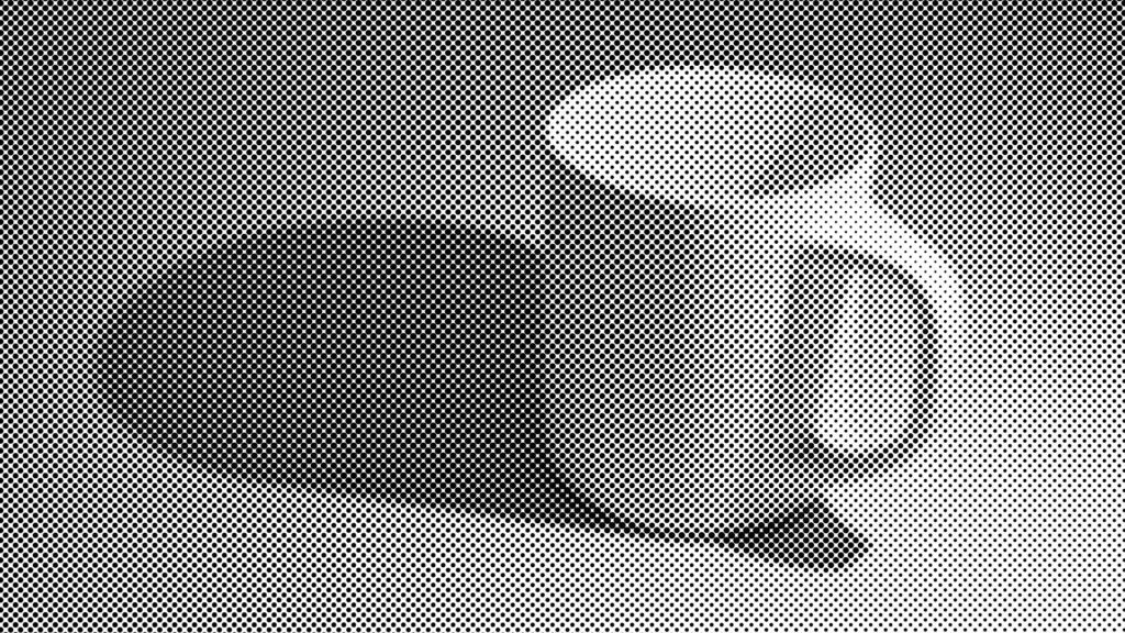
So far, I have reproduced the cover illustrations in reduced form in 3D and rendered them using Cinema4D’s Rasterizer. Since with my new workflow I’m working with 3D objects anyway, I’m using the modeled cup to output some views with Cycles, Blender’s raytracer.
Then I distort these images with a monochrome halftone modifier as Verfremdungseffekt and output the results as a 1C TIFF. The moirée effects that occur here due to the different frequencies between screen and halftone are negligible in print.
Detours and Alternatives
In my design process, it is important to me to always have a main direction that I explore. In addition to this main direction, I often work with “experiments” = spontaneous ideas that clearly leave the chosen path and playfully explore what else is possible outside the original idea. One of these ideas came from a conversation I had with Tom. The word “globe” came up. Initially dismissed as “too trivial”, the globe kept haunting my mind, but in order not to drift into the typical 90’s news studio look, I reinterpreted the globe. Maybe the “everyday object” could be something “organic”? The apple idea was born.

And this is what the covers could look like.

Likewise, I modeled two other designs of the cup and output them as a vector.


Round 2
After Tom’s initial feedback, we decided to keep the original mug and try to emphasize its profanity by liquid sloshing over the cup/spilling the floor.
This idea challenged me. To represent liquid and its physics in a believable way by manual drawing is enormously high effort. Also, I fear that we will have to revise the perspective and staging several times. So vectorizing a volume of liquid in Illustrator or in Affinity Designer and combining the drawing with the cup illustration is hardly an option. How can this fluid be generated as a 3D vector graphic? Once again, I go back into my 3D software and boot up “Manta-Flow”, Blender’s fluid simulation.


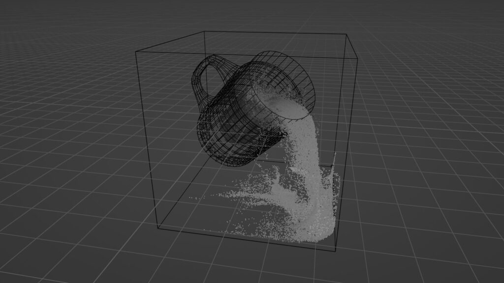
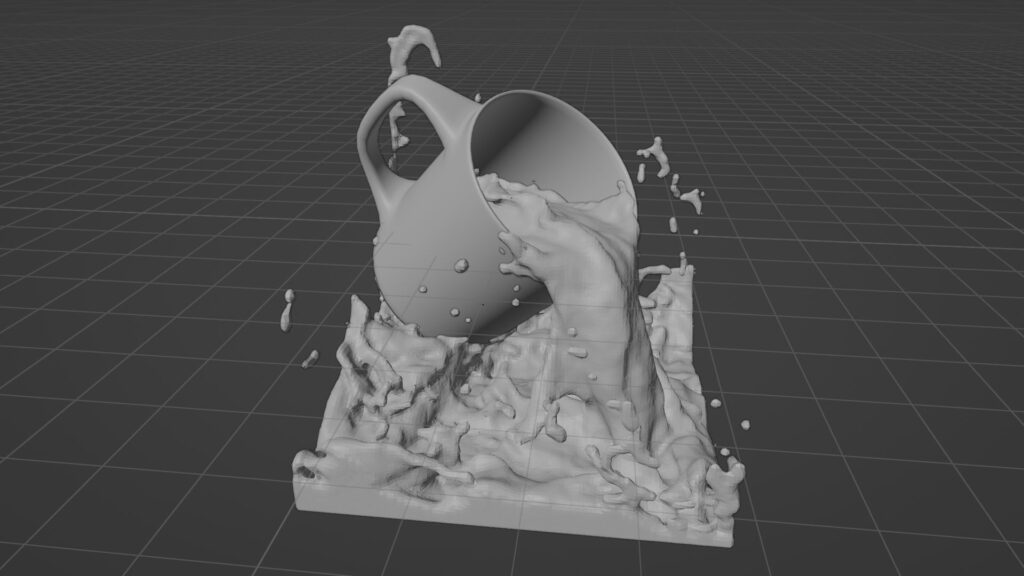
This works quite nicely. However, the calculations take about 25 minutes for the final version, which also returns decent collision values (if the resolution divisions are too small, the fluid will “clip” through the cup wall). The “baking” was done using CPU only since the volumetrics were too large for the GPU’s RAM. Even then, the 64 GB of RAM on my (outdated) workstation were almost consumed in toto. Also, some experimentation and tweaking is required for placing the fluid domain (i.e., the volume of fluid) in the scene so that a nice dramatic gush of water pours out of the cup, yet the scene remains calculable. As a final result, however, I get a convincing, physically correct mesh whose animation spans 200 frames. So now I’m in the comfortable position of being able to choose perspective and motion freely.
After the calculation, I pick out two promising frames for further tweaking:
Since this screenshot does not capture the Gestalt properties of the liquid properly, here a fast render of the scene

To be able to process/export the fluid as a mesh, I apply the effectors to the fluid domain in Blender, converting them from a voxel volume to a standard 3D mesh. Surprisingly, this works flawlessly without any delays. However, the mesh is extremely granular in resolution. When I export this resolution as a vector, there will only be a big “blob” of lines on the book’s cover. Since we aim for a distinctive futuristic/wireframe look, I apply a decimate modifier that will also trianglify the resulting mesh.

Again, the generative simulation results in the convenient situation that I can freely control the intensity of the Decimate modifier. So I slowly tweak my way to the desired look, which I then export as a 2D vector using the SVG export plugin. This way I can send Tom different versions of the fluid without having to manually redraw the scene each time.

Tom is happy so far and prefers version 3. Except for minor corrections to the vector and the color composition of the background (converting from AdobeRGB to a clean printable CMYK), this project is finished so far.

