Over ten years ago, in my bachelor’s thesis, I delved into font development using a then relatively new software called ›Glyphs‹. As I plan to engage more with typography again, I’ve decided to get reacquainted with Glyphs, now updated to version 3. Currently, I am designing a new typeface named ›Brokken‹. To force myself to master the workflows of Glyphs 3, I’ve opted to implement the font entirely within Glyphs without using any other production pipelines like drawing the vector shapes in Illustrator and use Glyphs to generate a font only.
Design and Aesthetics
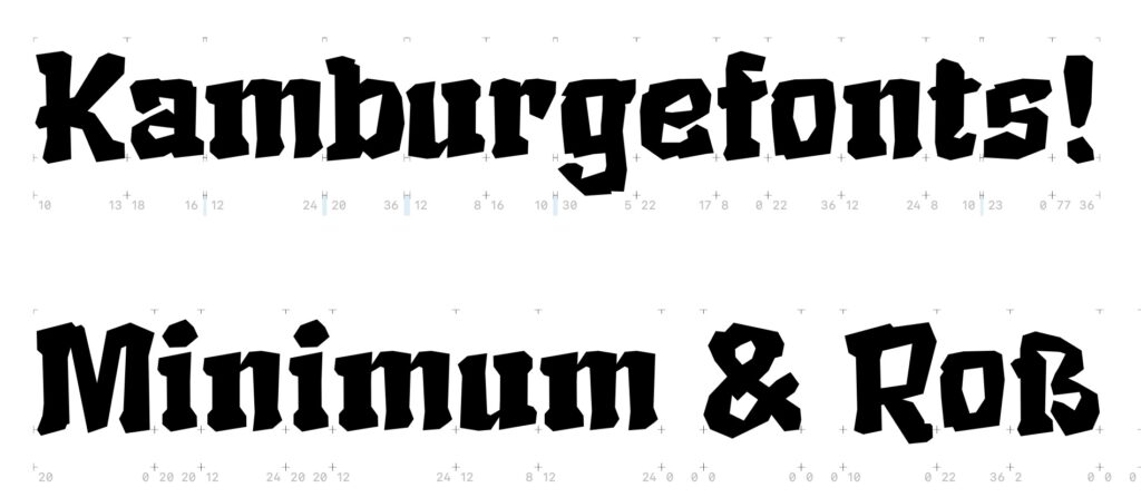
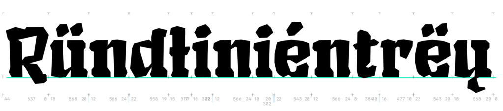
Brokken leans towards brutalist-inspired broken scripts, with elements borrowed from Textura and Fraktur-Grotesque combinations (that got a real bad reputation in the 1930ies). Therefore Brokken is also an attempt in investigating the typographic qualities of the so called ›Schaftstiefelgrotesk‹ and how these aesthetics can be transformed to a more pleasing looking design. Since back then the fonts such as Element or Tannenberg were almost exclusively used in a bold/heavy configuration Brokken also aims to explore how a normal or light version of these fonts could look like. In order to divert from the Brutalistic and propagandist connotations the font features a lot of quirks and characteristics resembling the quick scribbles made with a thick felt-tip marker. Interestingly, the resulting style resonates with a design language reminiscent of fantasy novels and pen-and-paper role-playing games from the 1980s.
Development
In developing this typeface, I set specific parameters as creative constraints:
The font eschews Bézier curves, instead indicating curves through sharp, “broken” edges.
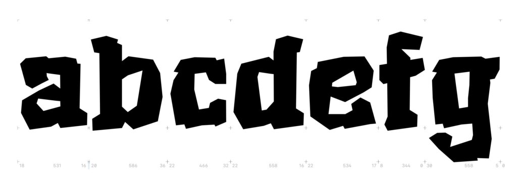
Each glyph consists of individual components that appear as though chiseled from rough stone—hence the name ›Brokken‹ (»Brocken« = German for chunk, bolder).
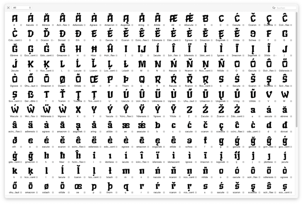
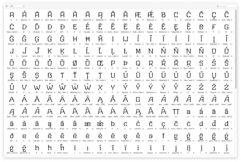
The typeface includes a complete character set to accommodate all European writing systems that can be represented with Western Latin scripts, boasting over 350 different characters to support languages like Icelandic, Polish, Croatian, and Slovenian.
I personally hate it when fonts don’t offer any arrows (which leads to abominations like this one: ->) , therefore I included a set of pointing arrows that fit the design language of ›Brokken‹.
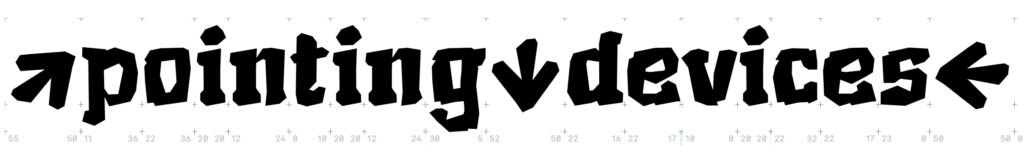
These arrows are automatically inserted once one of the following conditions appear: [minus] OR [hyphen] OR [endash] + [greater] substitutes to →; [smaller] + [minus] OR [hyphen] OR [endash] substitutes to ←, etc. So each software that is able to use ligatures and contextual substitutions (i.e. basically everything other than Powerpoint on Windows) replaces this letter combination: -> to this: → without any configuration.

At the moment the substitutions code is tiny, but I plan on extending the features:
sub [hyphen minus endash emdash] greater by rightArrow;
sub less [hyphen minus endash emdash] by leftArrow;
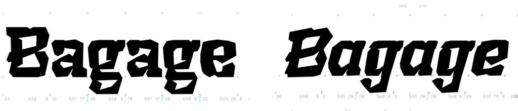
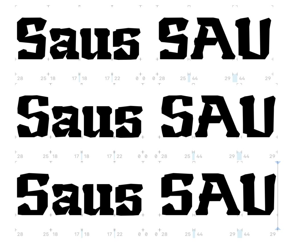
sub less [hyphen minus endash emdash] greater by leftRightArrow;With these substitutions I also implemented some solutions for otherwise problematic situations when using capital letters. Have a look at this example:
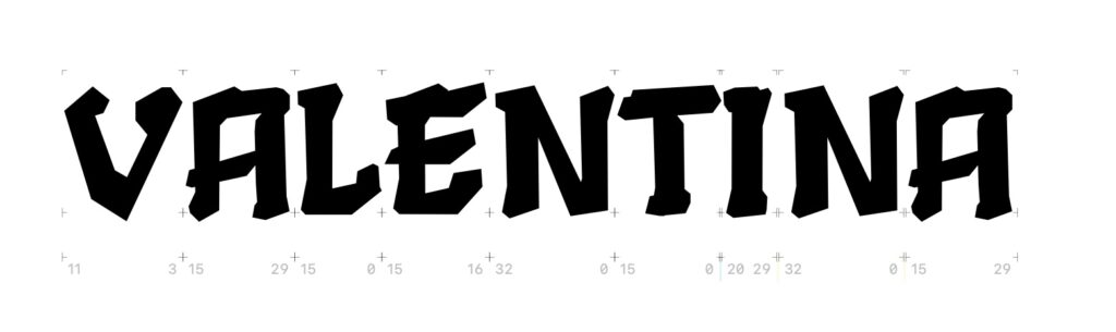
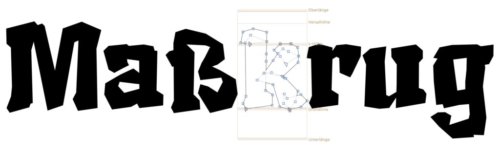
To address this problem, I drew an alternative and more traditional version of the capital A that is embedded as a stylistic alternate in the font.

Via context-sensitive this alternate replaces the standard glyph once a capital V is detected in front OR after the A.
This approach can become quite sophisticated: As of now, four different versions of the capital A are embedded in the font: One default version, a version witch respects left overhangs of the following capital letter, version that respects overhangs of the preceding capital letters (such as W, V, Y) and a version for words, where the capital A is in between two problematic letters (like: WAVE).
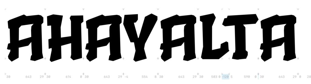
The example above demonstrates the problem: There are visible gaps in between the letters.
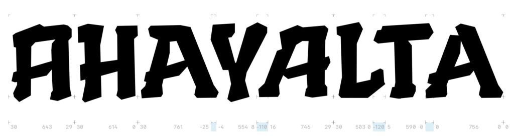
These substitutions happen automatically as open type feature while typing.

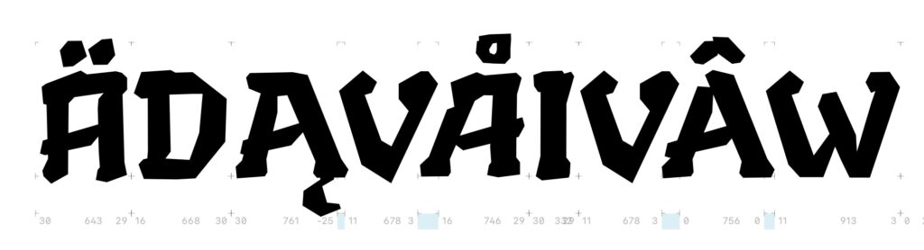
Since the capital A features 10 different combinations of diacritics (e.g. A, Ä, À, Á, Â, etc.) there needs to be glyphs/letterforms for these stylistic alternates as well. Also the substitution code needs to respect these variants.
Italics
Since Brokken has some playful charm to it, I decided that I wanted to develop a ›true‹ italic version of it instead of just an oblique. Therefore it is necessary that every single letter needs to be adjusted and tweaked. The significant advantage of this is that a true italic version of the font also presents an opportunity to add even more unique characteristics and playful elements to the letters. However, to avoid too much chaos, I straightened the serifs that were previously only slanted on the baseline, creating a clear finish at the line edge. I’m so pleased with the result that I’m considering using this design for the Bold and (future) Regular versions of the font as well.


The italics also feature certain stylistic alternates that can be used to replace some key letters when typesetting in order to enhance the visual separation of the bold from the italic version. Also the italic version features text figures (i.e. lowercase numbers) instead of the regular numbers (i.e. lining figures) from the bold version of ›Brokken‹.

The italic version is quite pronounced in its obliqueness: It is 12° slanted, which results in a quite obvious drift to the right. For a commercial font I would not take this risk, but since Brokken is a test ground, I want to gather some experience in designing an ›extreme‹ italic.
Redesigning of certain shapes
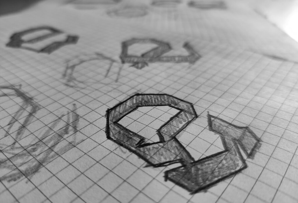
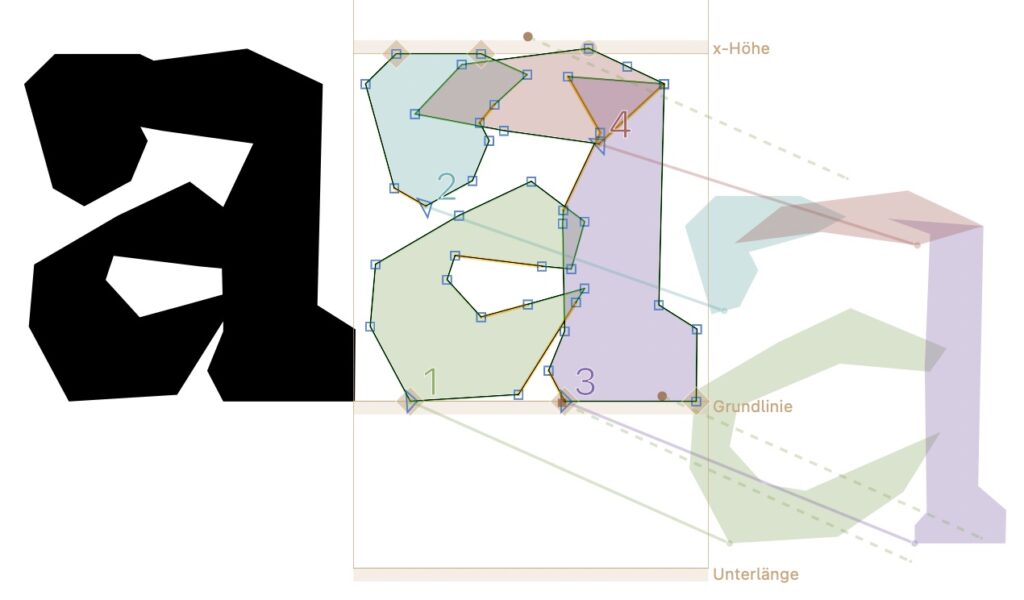
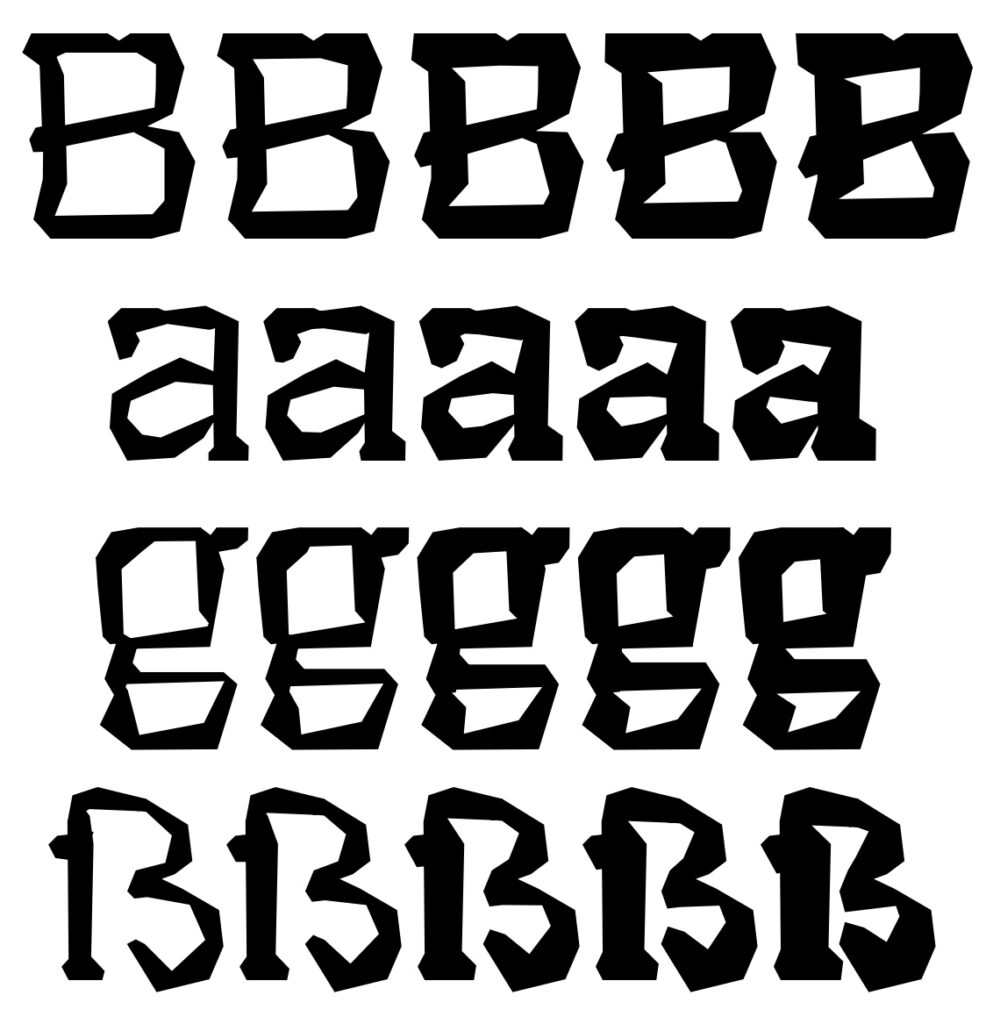
Although the overall ‘look and feel’ of the font was taking shape I am still not fully convinced that I found the perfect form for certain letters – especially the ‘e’ and ‘B’ were glyphs that need some rework. Until now I worked fully digital i.e. all shapes and forms were designed in Glyphs directly. However since I was unable to find a decent shape for the letter ‘e’ I decided to make some ‘analog’ drafts on a scetchpad.
I also took inspiration from the italics and redesigned every single glyph so that it features a nice grounding on the baseline (with the only exception being the underlines at letters such at g and y, some diacritics and of course the overshoot at certain ›round‹ letters).
In order to visually distinguish between the bold and italic version of ›Brokken‹ I also designed two glyph shapes for the letter ›g‹: The two story version will be featured in the italic, while the three story version will be featured in the bold (and later the regular) version of the font.
Full family: Multiple Masters
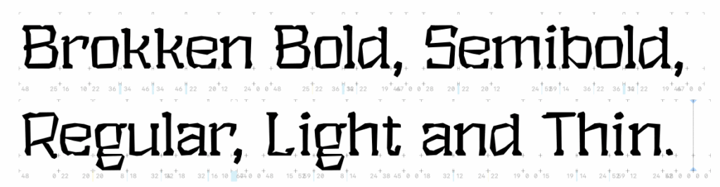
Until now the overall ’weight‘ of Brokken can be considered quite heavy and bold. To expand the font into a ‘family’, at minimum a ‘Regular’ weight is required. Glyphs offers a highly efficient workflow for this process, where the thickest (bold) and thinnest (thin) weights are manually designed, while the intermediate weights are automatically generated through interpolation of the anchor points’ coordinates. To test this feature, I decided not to manually design the Regular weight – instead, I created an extremely thin version of Brokken, allowing the software to automatically generate the Regular, Light, and Semibold weights. This approach is known as ‘Multiple Masters‘ and can also be used for italic variants in the future.
However, to work with this technique, it’s essential to manually craft the extrema (i.e. the ’master‘ thin and the ’master‘ bold weight), ensuring the number and sequence of anchor points remain consistent between the two masters.
In order to stick to this workflow it was necessary to draw a full glyph set of the light weight of Brokken manually – all automatic tools and scripts were not able to create any meaningful results.
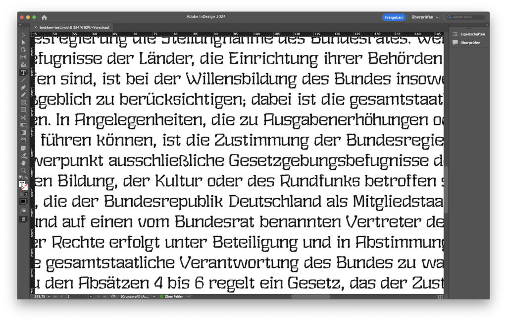
Since the shapes of the letters changed it was necessary to tweak spacing and kerning to create a pleasing overall look. Mac OSX behaves very poorly if multiple versions of the same font are installed, therefore I did not install Brokken globally but set up a small test environment within InDesign to get a first impression of the font and its particularities, characteristics and bugs.
Once this master was set up, Glyphs is able to automatically generate any weight that lays in between the thin and bold weight of Brokken. Therefore I exported a light, regular, and semibold variant with automatic hinting.
Design Process
With my experiments I follow an iterative design approach – therefore a lot of characters are in a constant state of change. Although this process is cumbersome and leads to a lot of work thrown into the bin it is crucial to view each shape in context to find the ›right‹ design decisions.
Building Process
Since the font is intended to be submitted to Google Fonts in the future, the development process must adhere to specific guidelines. This means that the font should not be exported using the export function in Glyphs. Instead, a custom build process using fontmake is required. Additionally, the TTF version for Windows needs custom hinting and specific flags in the 'gasp' table. These adjustments cannot be made with Glyphs alone, so after building with fontmake, the corrections must be done using gftools fix-hinting. Following this procedure, the font must be checked with the command-line tool fontbakery.
To automate this build process, which runs in its own Python environment, I created a basic Bash script that sequentially performs all the necessary steps. For the regular (non-italic) variant of the Brokken font, completing all the steps, including generating the final report, takes about 100 seconds.
#!/bin/bash

# initialize python3 virtual environment
source myenv/bin/activate

# clean the export folder
echo "deleting all contents of fonts folder"
rm -rf $HOME/Documents/GitHub/brokken/fonts/*

# build the font using fontmake
echo "building font with fontmake"
cd $HOME/Documents/GitHub/brokken/fonts
fontmake -i -g ../sources/brokken.glyphs -a

# correct ttf version with gftools
echo "gftools"
cd $HOME/Documents/GitHub/brokken/fonts/autohinted/instance_ttf
for font in *.ttf
do
    gftools fix-hinting $font;
    if [ -f "$font.fix" ]; then mv "$font.fix" $font; fi
done

# check font with fontbakery
echo "checking font with fontbakery"
fontbakery check-googlefonts Brokken-Bold.ttf --full-lists

# cleanup
echo "moving autohinted contents to default instance_ttf folder"
mkdir -p $HOME/Documents/GitHub/brokken/fonts/instance_ttf
cp -r $HOME/Documents/GitHub/brokken/fonts/autohinted/instance_ttf/*.ttf $HOME/Documents/GitHub/brokken/fonts/instance_ttf
rm -rf $HOME/Documents/GitHub/brokken/fonts/autohinted

echo "renaming instance_ttf and instance_otf to ttf and otf"
mv $HOME/Documents/GitHub/brokken/fonts/instance_ttf $HOME/Documents/GitHub/brokken/fonts/ttf
mv $HOME/Documents/GitHub/brokken/fonts/instance_otf $HOME/Documents/GitHub/brokken/fonts/otf

# make a copy of the otf files in the document directory for testing in InDesign
echo "copying the contents of otf folder to the InDesign test folder"
cp -r $HOME/Documents/GitHub/brokken/fonts/otf/*.otf $HOME/Documents/GitHub/brokken/test/"brokken-test Ordner"/"Document fonts"
After countless adjustments, Brokken now successfully passes the fontbakery test.
Status Quo & Download
I am developing ›Brokken‹ as an open-source (and open-end) project without any warranty. Both the source code and the finished font are freely available. All data can be accessed on GitHub. If you are interested in a usable binary font, have a look at the releases on the GitHub page here.
Important
Certain Open Type features cannot be used in MS Word: If you need these features (e.g. automatic glyph replacement, automatic arrow replacement, …) use a proper DTP program (i.e. InDesign, Quark Xpress, Scribus, LaTeX) or Libre Office instead.
Window users in general: Please use the ttf not the otf file, otherwise kerning will not work properly.
Appendix
Useful tools
- https://typography.com/blog/text-for-proofing-fonts
- https://justanotherfoundry.com/generator
- http://www.cyreal.org/Font-Testing-Page/
- https://gist.github.com/eisensafran/36e9e588b86b2deb18eb857d2d2d11c4 (a personal list with difficult letter combinations)
- https://gutenberg.org/ebooks/ (Great if you need some long body text for testing – you can filter language systems to cater your needs.)