As part of my work as a postdoctoral researcher at the RRC, I am currently developing a ‘new’ format of science communication. In this context, I do not understand science communication merely as the communication of science, but in this case, as communication about science. Specifically, the aim is to address the question of what it actually means to study at a college or university. Or more precisely: What truly defines a ‘successful’ course of study? Is it ECTS credits, knowledge, or personal development?
Target audience: high school graduates and students in the early stages of their undergraduate studies.
Observation: It is often only after graduation that many students realize the actual benefits of their studies. Only in hindsight do they recognize how many opportunities (e.g., a year abroad, student council, committee work, etc.) they missed out on. It also becomes clear afterwards that a sole focus on the core academic subject may be effective but is ultimately not desirable. Furthermore, aspects such as the funding of research and teaching, which directly affect students, often only become apparent after graduation. In dialogue with students at various stages of their academic journeys, we have observed that these aspects are often implicitly present in many graduates of the academic system, but only as implicit knowledge, or tacit knowledge, which can only be verbalized through extended dialogue and very targeted questioning.
It is, therefore, not easy to uncover which tips ‘veterans’ (i.e., those who have been or are successful within the academic system) would pass on to prospective students and early-stage undergraduates. This leads us to a classic problem in communication science: According to the SECI model,1 such tacit knowledge can only be conveyed through socialization and externalization—a challenge we aim to address through a game, in which this socialization can take place in a confined and ‘safe’ space.
We don’t need no education…
The university system encompasses a wide range of aspects and subsystems, many of which are incommensurable, meaning they are difficult to articulate. At the same time, there are significant differences between academic cultures, as well as between the emotions and motivations of individual students. In other words, there is no single ‘university system’, but rather a multitude of parallel and often contradictory subsystems that together form ‘the university’ as a whole.
To address the challenge of communicating this complex configuration, we employ an approach that does not rely on singular, and thus somewhat ‘authoritative’, forms of communication. Instead, we focus on self-experience. In a workshop, we referred to this method under the slogan ‘from education to experience’. Rather than writing a (book) guide or giving a lecture—formats that can hardly capture the diversity and complexity of the ‘system of academia’—we aim to foster an inner, subjective experience that gives participants a sense (and thus an implicit understanding, i.e. the aforementioned ‘socialization’ of the SECI-model) of what it might mean to be a ‘successful’ student.
Integration of the Game into the Core Curriculum
The game is intended to be incorporated into the Core Curriculum developed by the RRC. This ensures that the game will actually be played and won’t become a stillborn project; however, this integration also brings certain requirements: Since the board game is to be played ad hoc within a teaching session, the combined time for both gameplay and explanation must not exceed roughly two hours. Consequently, the game mechanics must be easy to grasp, even for individuals who are not familiar with board games, and the game itself must fit within this tight time frame.
Game Mechanics and Architecture
The game design combines competitive and cooperative elements, aiming to reflect, in part, the dynamics of a ‘real’ academic experience. The objective of the game is for all players to collaboratively accumulate 120 ECTS credits (thus successfully completing a (European) bachelor’s degree). However, the individual player who collects the most Knowledge Points (representing the most knowledge gained during the game) is considered the winner. This distinction highlights the fact that ECTS credits do not equate to actual knowledge.
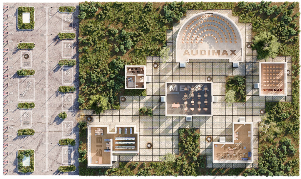
The game mechanics merge aspects of a traditional board game with elements of a card-deck-building game. As a spatial ‘setting’, we chose the campus, featuring several typical university buildings, such as the main lecture hall (Audimax), cafeteria (Mensa), library, and more. These locations each have a specific function within the game, aligned with their real-world purpose. For example, players can earn Knowledge Points in the library, reorganize their card deck in the student council (Fachschaft), and so on.
It’s OK to Take a Detour
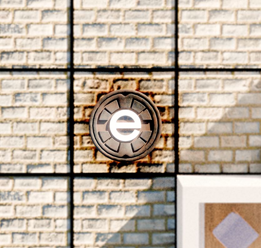
Players move around the game board from building to building using the sum of two dice rolls. However, the outdoor areas also contain special event spaces, often located in spots that are not on the direct path between two buildings. Upon reaching these spaces, the player draws an event card, which may offer a significant advantage or disadvantage for the rest of the game.
This game board configuration aims to instill a key lesson in players: many important and interesting events during a course of study don’t necessarily occur within the typical settings, such as the lecture hall. Encounters like randomly meeting someone in the hallway, which may lead to a friendship, or approaching a professor on the way to class, which could result in a bachelor’s thesis supervision or a student job, are vital experiences. While these elements are difficult to convey as concrete advice, they can easily be translated into game mechanics. Thus, metaphorical concepts are turned into spatial ones: despite the structured nature of the Bologna system, it is entirely acceptable to take a “detour” in one’s studies—one that can be personally enriching.
The Game as a Safe Space
The game’s communication format also serves as an experimental space, governed by a finite set of rules, simplifying the otherwise infinitely complex ‘university system’ into a manageable number of principles. In designing the game, there is a constant need to balance abstraction and concretization, carefully considering which elements of the academic experience are represented and how. At the same time, the game runs the risk of reinforcing normative aspects and stereotypes about the academic system, a potential pitfall that must be consistently reflected upon throughout the development process.
This safe space allows players to explore and engage with the academic system’s complexity within defined, simplified parameters, offering room for experimentation without real-world consequences. However, it is crucial to ensure that the game remains flexible and inclusive, avoiding the unintentional reinforcement of biased or limited views of academic life.
Developing a Visual Language for the Game
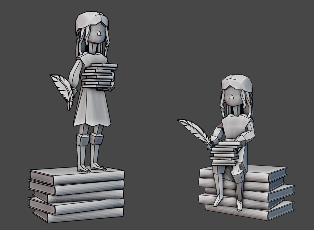
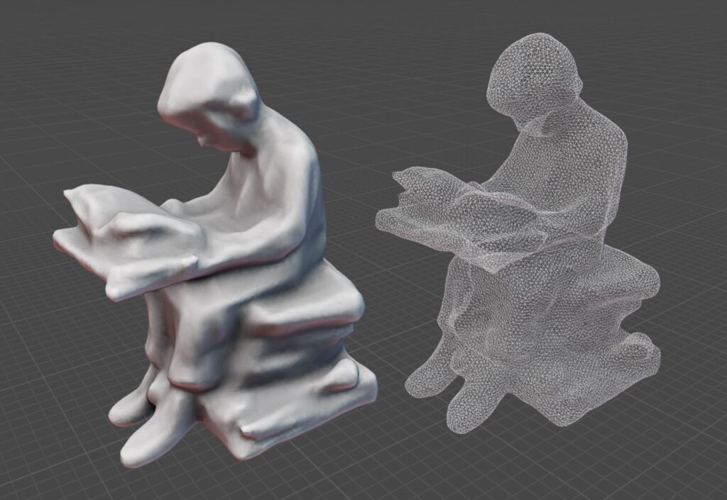
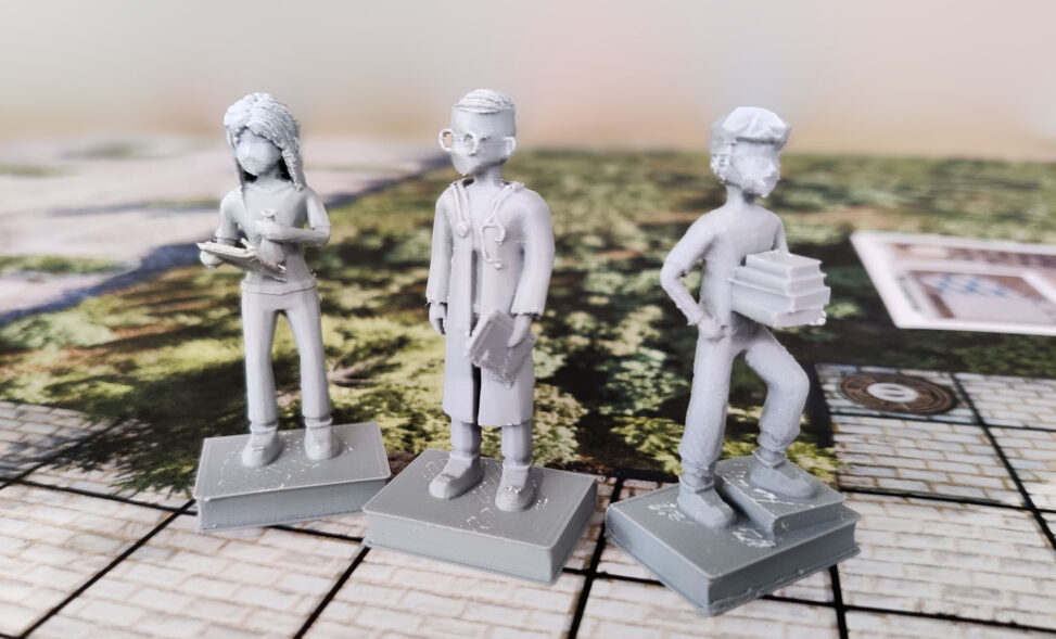
An example of how drastically complex systems must be reduced to a few categories can be seen in the design of our game pieces. We had to condense all academic disciplines into six broad categories: engineering, humanities, economics, law, medicine, and natural sciences. Since players are meant to identify with ‘their’ game pieces, we decided not to use generic tokens but rather fully modeled, 3D-printed figures for the game.
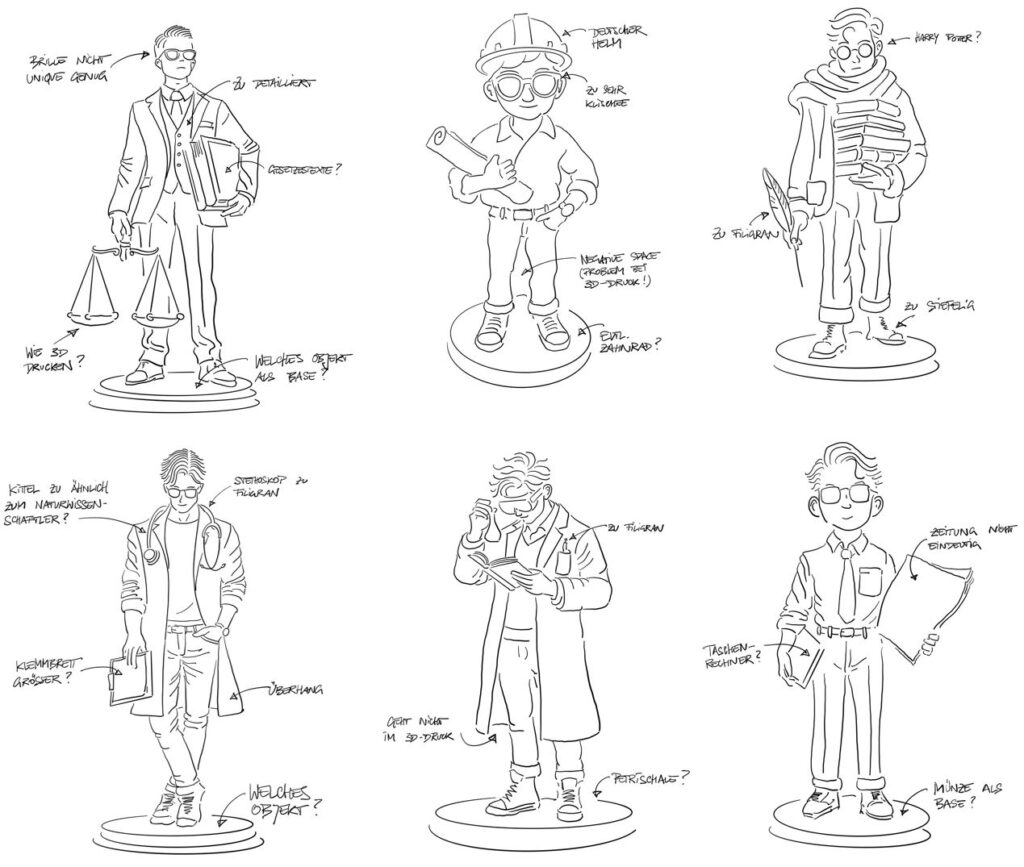
In doing so, we had to consider the level of detail these pieces should have: Should they be more abstract, allowing for a broader range of identification, or should they be designed in a more naturalistic and detailed manner? This decision is crucial in shaping how players connect with the game material, and whether a simplified or more realistic visual representation better serves the game’s goal of fostering identification and immersion. The balance between abstraction and detail is key, as it influences how players perceive their role and the broader academic categories within the game.
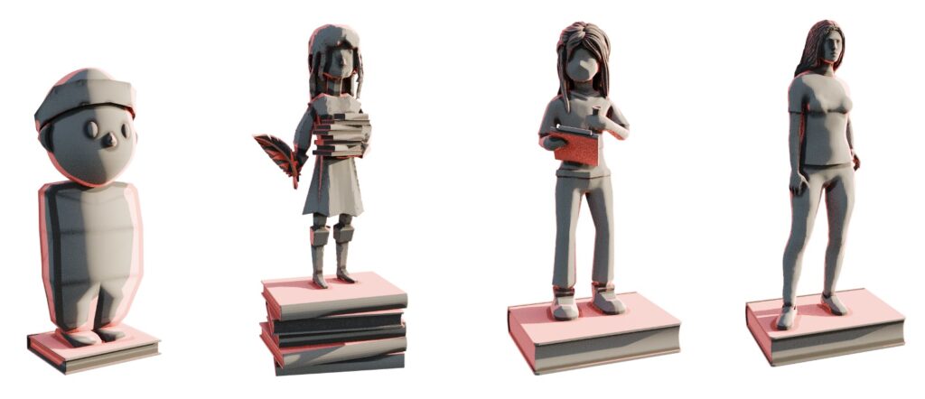
As of now, I am working with a pseudo-realistic design approach (as depicted in the third model in the figure): the game pieces are clearly modeled as human figures but certain features are deliberately exaggerated to avoid the risk of falling into the uncanny valley.2 This less abstract representation—also applied to the game board and other game materials—follows a principle from UX design. Research in UX has shown that users understand unfamiliar interfaces more quickly when the design mirrors the appearance of the physical objects they represent.3
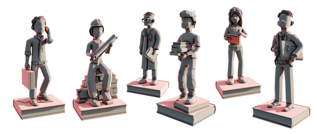
Although our board game does not include a virtual or digital component, the challenge is similar. Our players, too, should grasp the game as intuitively as possible within the context of the Core Curriculum. For this reason, we consciously avoid further visual abstraction, aiming to keep the learning curve as gentle as possible. By sticking to more familiar, recognizable forms, we help players engage with the game without the distraction of decoding unfamiliar or overly abstract representations.
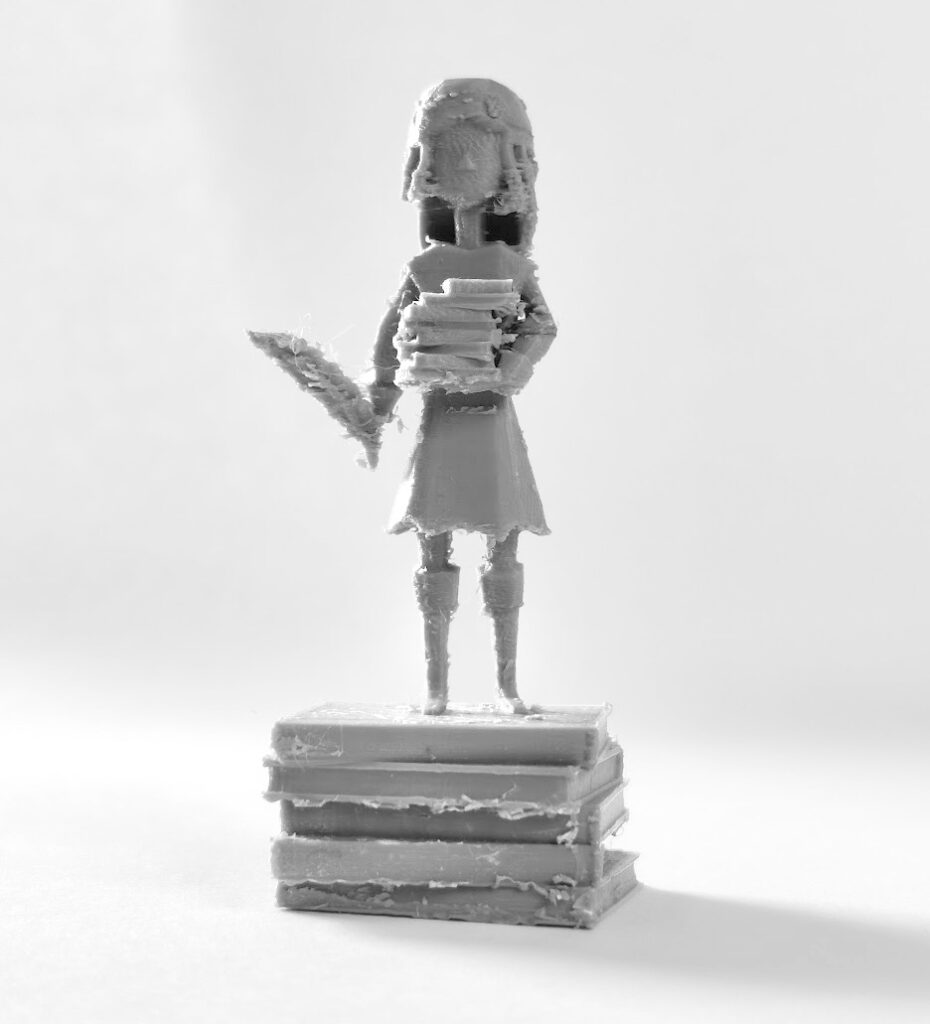
At the same time, the game concept envisions that the game and all its materials will be made freely available as an Open Educational Resource. To enable the production of game pieces on more affordable 3D printers within a reasonable time frame, the models are intentionally designed without overly fine details, and geometric overhangs are minimized to facilitate printing.
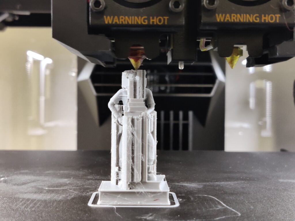
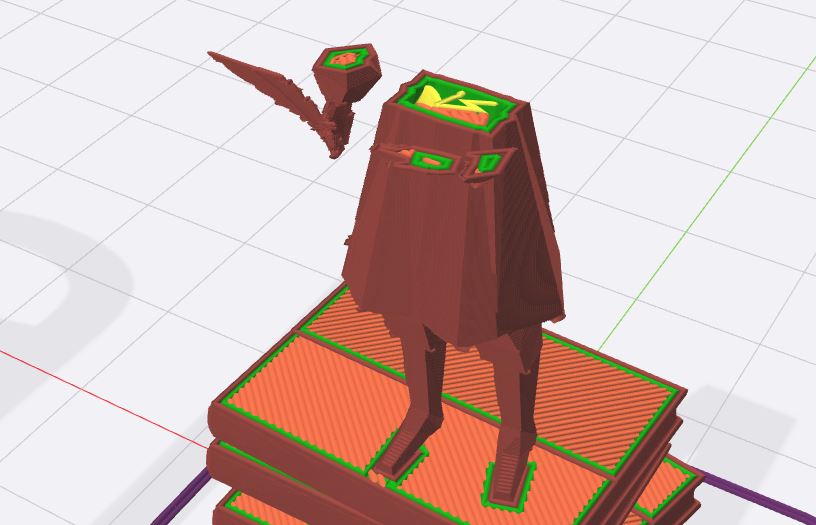
The final game pieces were modeled entirely using Blender, without external plugins or meshes. Since each figure assumes a unique pose, all 3D models were fully rigged (i.e., equipped with an internal skeleton for movement simulation). The physical objects were produced using a Raise 3D N2 printer in the Media Aesthetics Lab at H-BRS. The conversion of 3D geometry into machine code (slicing) was done with IdeaMaker.
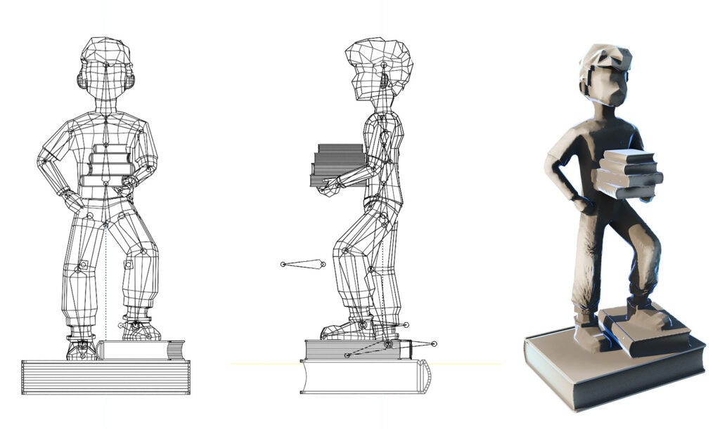
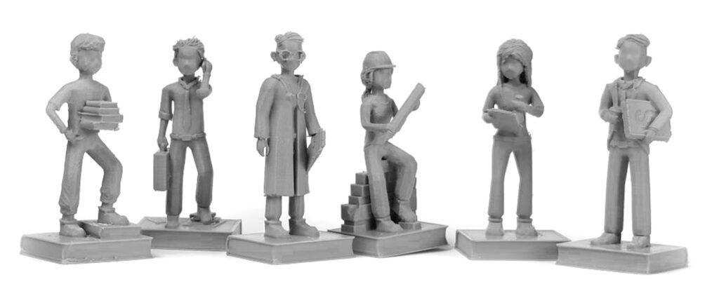
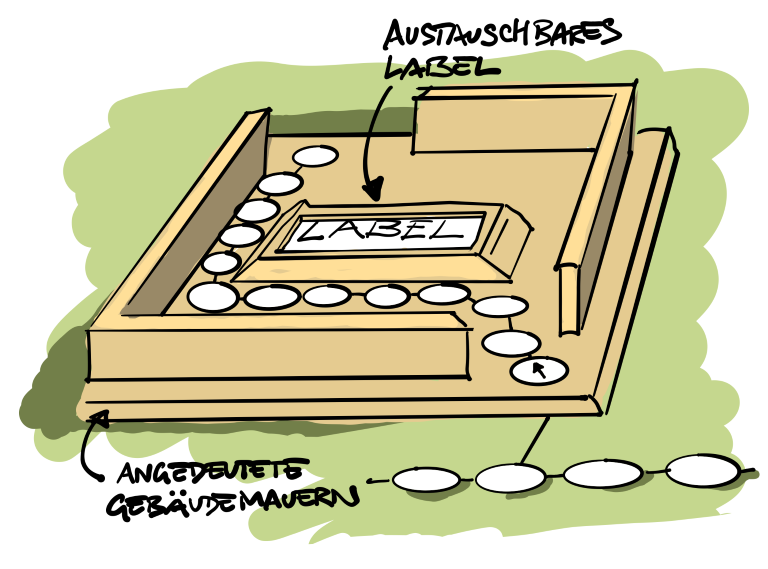
In addition to the game pieces, further game materials are required, which should align in terms of haptics and appearance with the design of the game board and the pieces. As a small novelty, for instance, the counter for individual knowledge points on the game board is designed as a bicycle rack, which is why it makes sense for the counter token to be shaped like a small bicycle. To ensure the easiest possible printability with a 3D printer, the 3D model is kept relatively ‘chunky’.
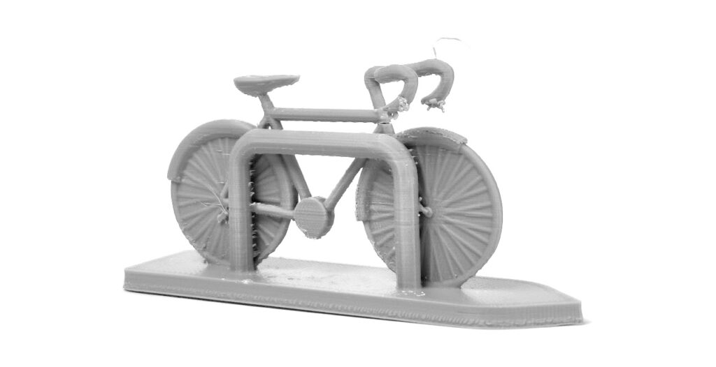

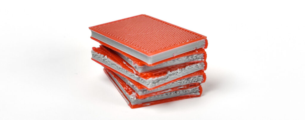
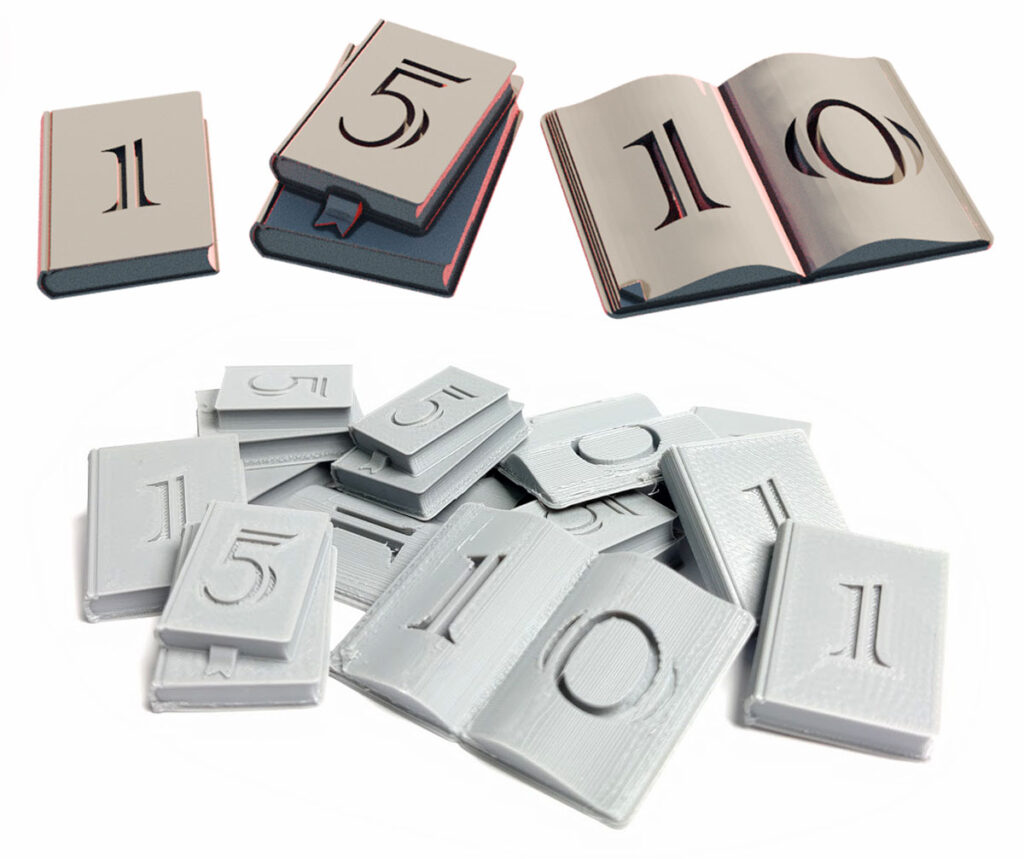
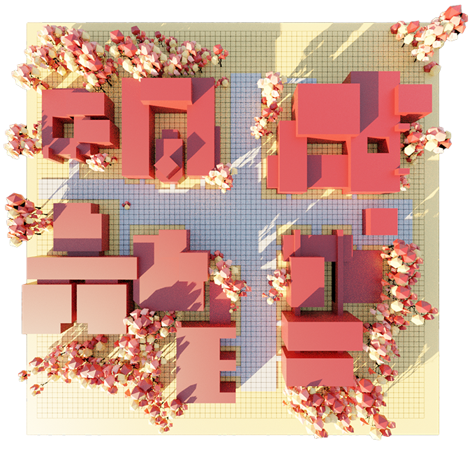
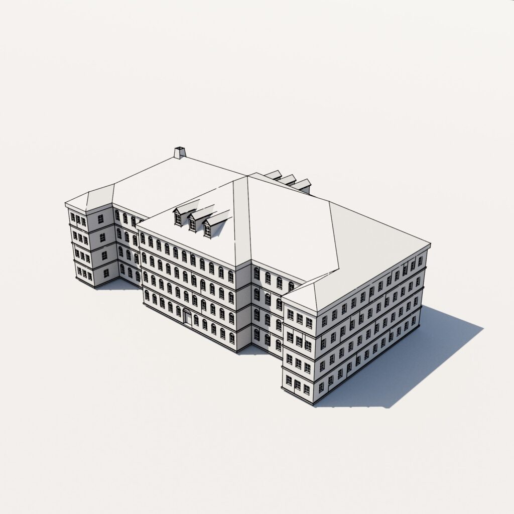
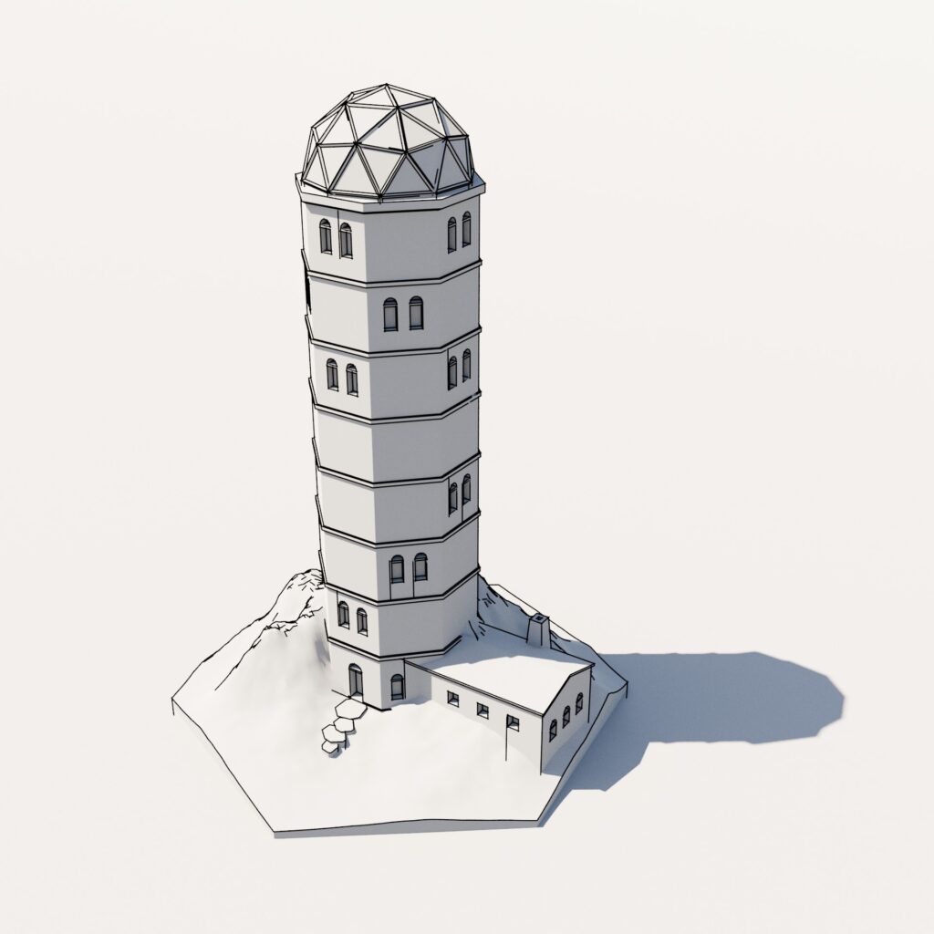
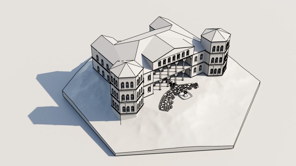
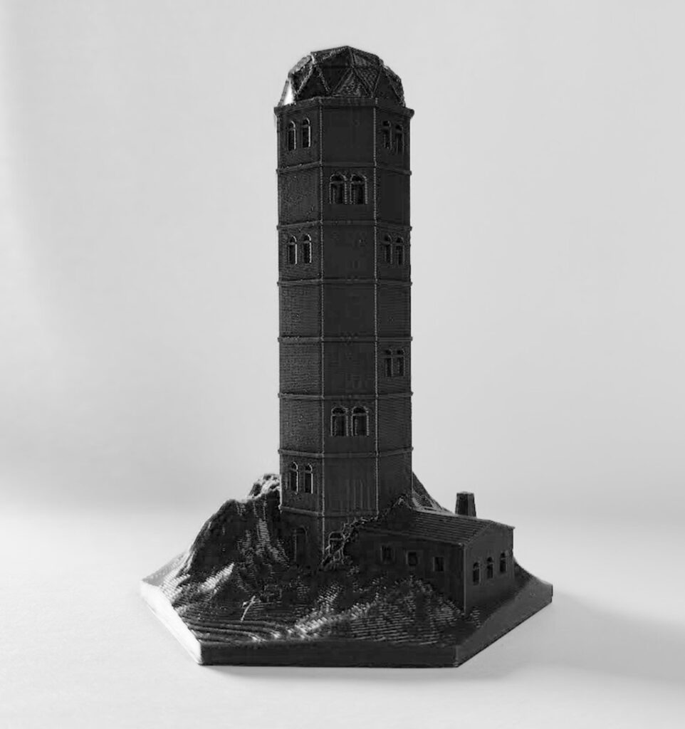
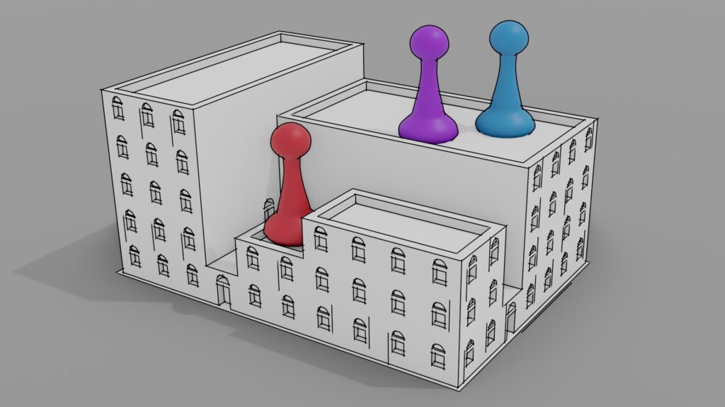
The same aesthetic and design considerations also applied to the game board, which has undergone five different iterations, each reflecting changes in game mechanics. I also experimented with 3D-printed buildings for the board, but this proved impractical since the figures need to be able to physically enter the buildings during gameplay. Therefore, other design solutions were explored to maintain both functionality and aesthetic coherence.
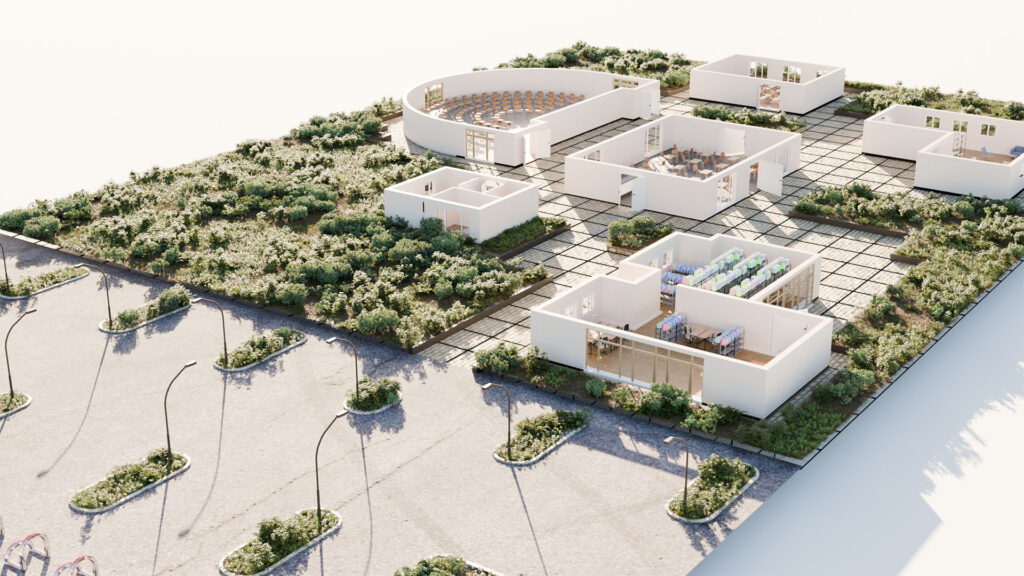
The current version features a classic game board depicting a campus and parking lot. Players move their figures across the grid on the board, and the parking lot holds the remaining game materials, such as card decks, mission cards, and two counters that track ECTS and knowledge points.
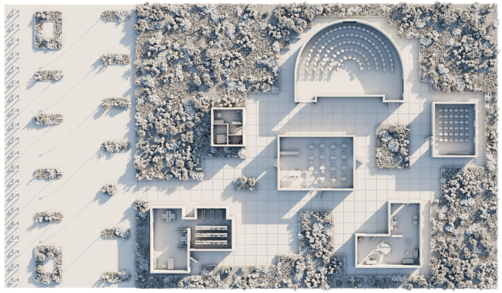

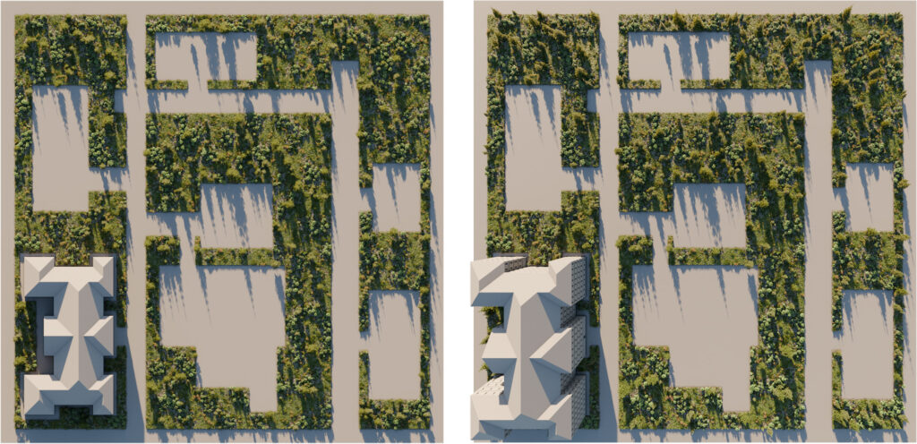
The campus was entirely modeled in Blender, with GeoScatter used for vegetation. Textures and a few 3D models were sourced primarily from PolyHaven and Patternpanda. The game board was rendered using Blender Cycles at a resolution of 10,000 x 8,000 pixels, resulting in a physical print size of 1.55m x 0.9m. The ray-traced rendering, simulating physically accurate lighting, took approximately 160 minutes on an NVIDIA RTX 3080. After rendering, additional objects such as stairs, extra vegetation, decorative elements, typography, and event fields were added using Photoshop.
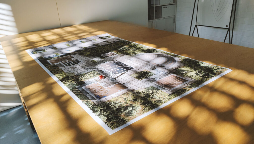
The large size of the board (and the player figures moving on the grid) was a deliberate choice to accommodate the game’s use within the Core Curriculum, where it will be played in a classroom setting. This scale ensures that even bystanders can follow the game, enhancing engagement in a group learning environment.
Designing the cards
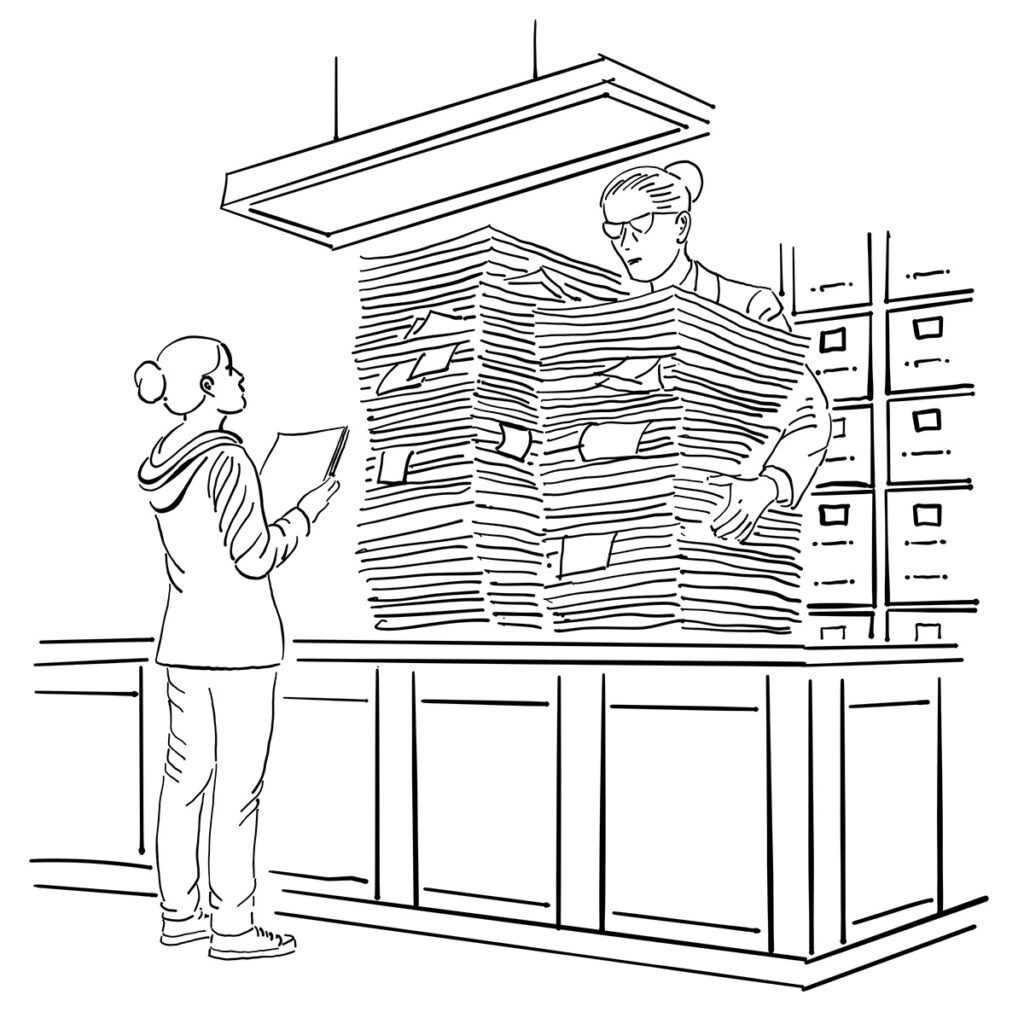
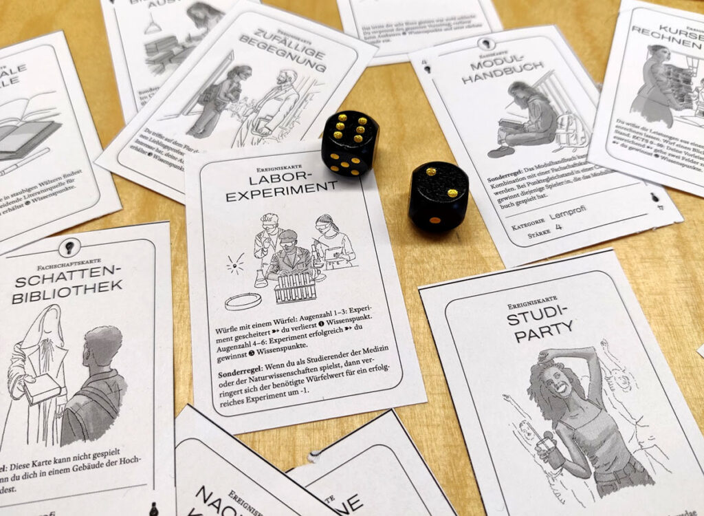
Since the game consists not only of tokens and a game board but is designed as a hybrid between a board game and a card deck builder, it is necessary to visually design a large number of distinct cards. Given that these cards play a pivotal role in the game, we decided that each card type should have its own unique graphic, tailored to the card’s content. One option would be to create these graphics using generative AI; however, considering the immense passion already invested in this game, it does not seem appropriate to forego creating original illustrations at this stage. Furthermore, as previously mentioned, visual coherence is important to ensure the game appears as a cohesive whole – a requirement that is difficult to implement with AI.
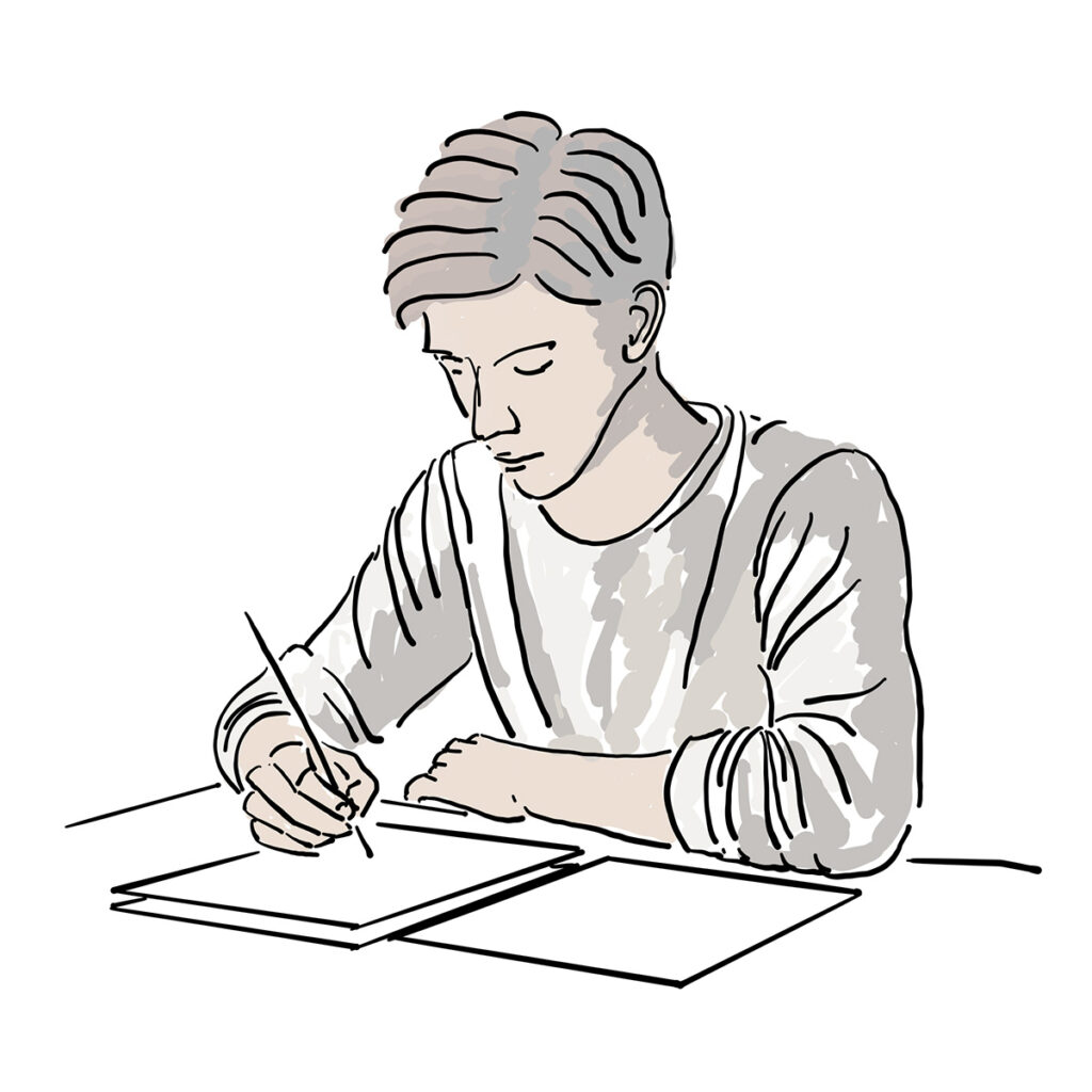
For this reason, a visual style is needed that allows for relatively quick results, aims for a similar balance between abstraction and naturalism as seen in the game pieces, and whose workflow/toolset enables the production of print-ready graphics that can also work in black and white if the end user do not have access to a color printer. To meet these requirements, I am currently experimenting with hand-drawn vector graphics that are rudimentarily colored but are heavily inspired by ligne claire. Instead of using Procreate, I am employing Adobe Fresco, as it can export “true” vector graphics.

Open Educational Resources
As already stated, the goal is to make all game materials, along with the instructions, available as Open Educational Resources under a Creative Commons license for free and unrestricted use, in order to achieve the widest possible dissemination of the board game. For this reason, I ensured during the creation of all game materials that the production pipeline exclusively incorporates tools that allow the release of open files. This is particularly relevant for the 3D models of game pieces and materials, as end users will need to adjust these files to their respective 3D printers and slicing softwares. Therefore, they rely on editable file formats (e.g., *.stl or *.fbx). Typical commercial 3D applications operated under an academic license generally do not permit such releases, which is why I am pleased that Blender, an open-source application, exists and allows for such productions.
Additionally, I place great importance on ensuring that all 3D models can be printed in a reasonable amount of time and without special technical requirements. For this reason, I deliberately avoided overly delicate structures, large overhangs (to eliminate the need for support structures), and especially multi-color printing.
Development Methodology: Process Aesthetics of an Experimental Approach
The development of the game follows an iterative and experimental methodology. While I am currently primarily responsible for the design and mechanics, numerous people have contributed to the game’s creation. The initial concept emerged during an internal RRC workshop as part of project 3, and a project team of students from H-BRS developed some core game mechanics.
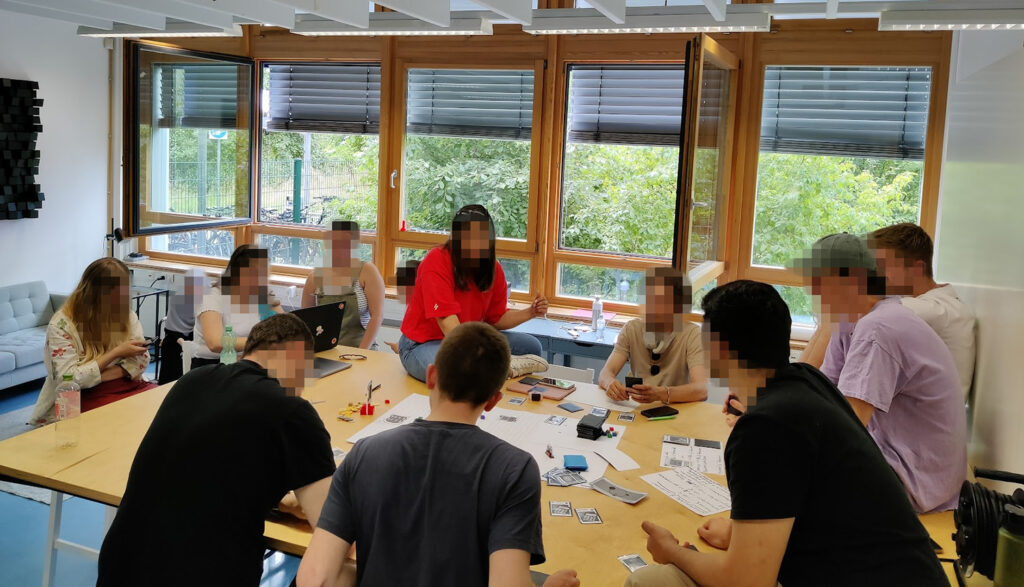
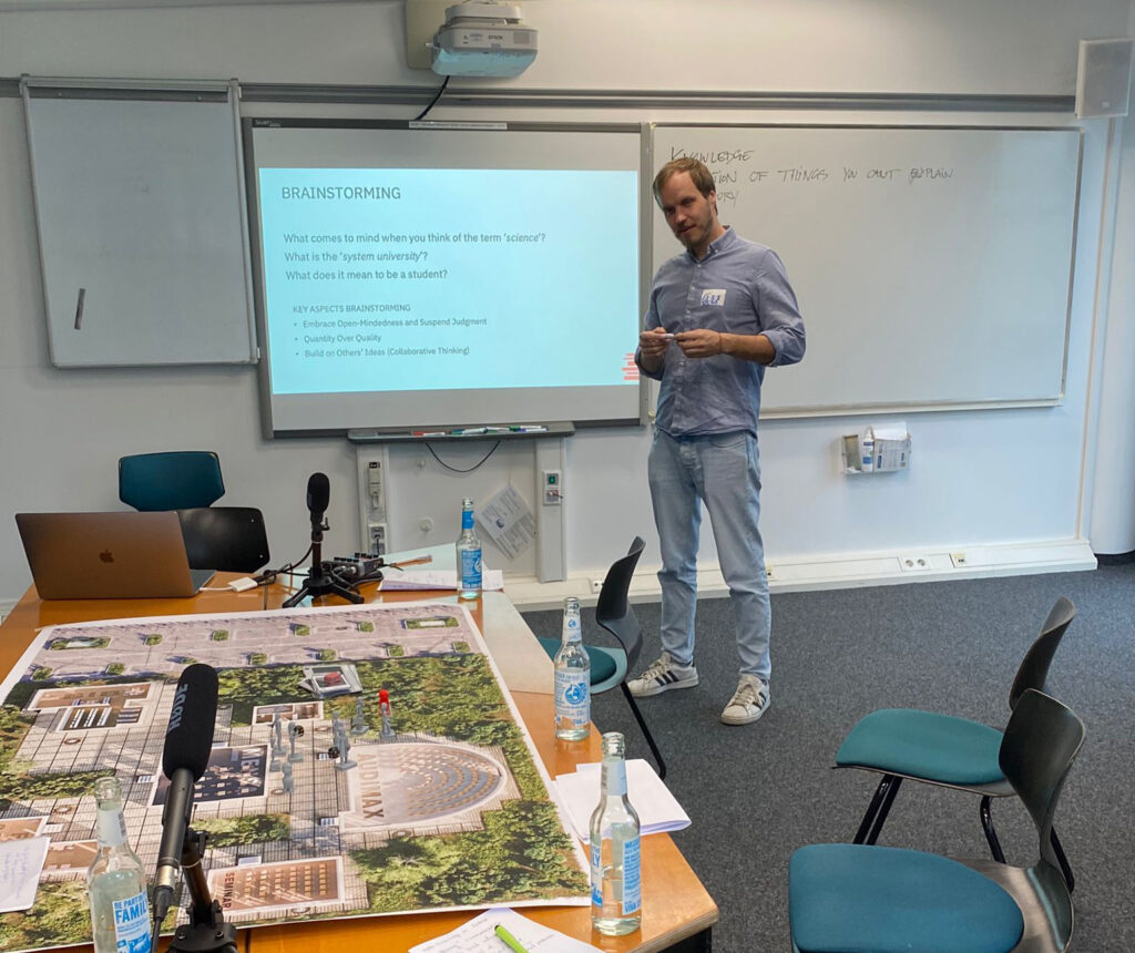
Naturally, this approach generates many prototypes and drafts, most of which ultimately have to be discarded. This constant cycle of creation and refinement is a key part of the process, as new ideas are tested, evaluated, and either incorporated or set aside in favor of more effective designs.
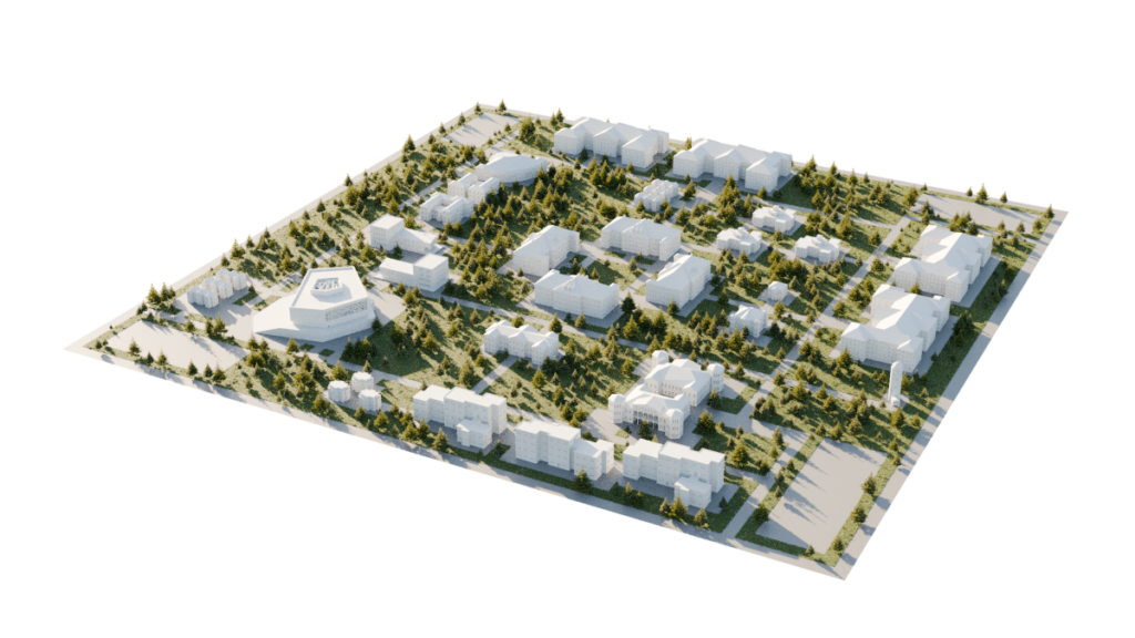
To highlight this creative journey, I am showcasing a gallery of rejected drafts and prototypes that, while not realized, were integral to the game’s development. These designs, even if abandoned, represent important steps in the evolving process, each contributing to the final product.
Gallery of discarded/rejected ideas
Footnotes & References
- Nonaka, I. (2009). The knowledge-creating company. In The economic impact of knowledge (pp. 175-187). Routledge. ↩︎
- Mori, M., MacDorman, K. F., & Kageki, N. (2012). The uncanny valley [from the field]. IEEE Robotics & automation magazine, 19(2), 98-100. ↩︎
- This is an ongoing discussion. For further reference see: Oswald, D., & Kolb, S. (2014). Flat design vs. skeuomorphism–effects on learnability and image attributions in digital product interfaces. In DS 78: Proceedings of the 16th International conference on Engineering and Product Design Education (E&PDE14), Design Education and Human Technology Relations, University of Twente, The Netherlands, 04-05.09. 2014 (pp. 402-407), and: Cho, M., Kwon, S., Na, N., Suk, H. J., & Lee, K. (2015, April). The elders preference for skeuomorphism as app icon style. In Proceedings of the 33rd Annual ACM Conference Extended Abstracts on Human Factors in Computing Systems (pp. 899-904). ↩︎
Comments are closed.